library(tidyverse)
library(openintro)
library(sjPlot)
library(ggpubr)
library(gtsummary)

loans <- loans_full_schema %>%
  select(loan_amount, interest_rate, term, grade,
         state, annual_income, homeownership, debt_to_income) %>%
  mutate(grade = factor(grade, ordered = TRUE)) %>%
droplevels()Visualising categorical data
wk2-d04-viz-cat
Recap
Setup
Variables
- Numerical variables can be classified as continuous or discrete based on whether or not the variable can take on an infinite number of values or only non-negative whole numbers, respectively.
- If the variable is categorical, we can determine if it is ordinal based on whether or not the levels have a natural ordering.
Data
glimpse(loans)Rows: 10,000
Columns: 8
$ loan_amount <int> 28000, 5000, 2000, 21600, 23000, 5000, 24000,…
$ interest_rate <dbl> 14.07, 12.61, 17.09, 6.72, 14.07, 6.72, 13.59…
$ term <dbl> 60, 36, 36, 36, 36, 36, 60, 60, 36, 36, 60, 6…
$ grade <ord> C, C, D, A, C, A, C, B, C, A, C, B, C, B, D, …
$ state <fct> NJ, HI, WI, PA, CA, KY, MI, AZ, NV, IL, IL, F…
$ annual_income <dbl> 90000, 40000, 40000, 30000, 35000, 34000, 350…
$ homeownership <fct> MORTGAGE, RENT, RENT, RENT, RENT, OWN, MORTGA…
$ debt_to_income <dbl> 18.01, 5.04, 21.15, 10.16, 57.96, 6.46, 23.66…Bar plot
Bar plot
ggplot(loans, aes(x = homeownership)) +
  geom_bar()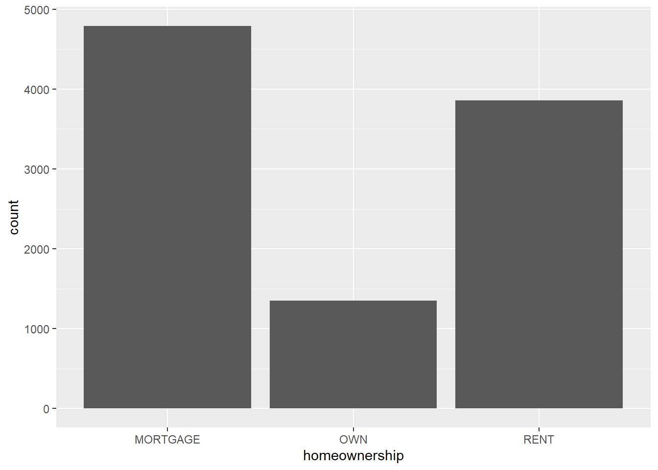
Segmented bar plot
ggplot(loans, aes(x = homeownership,
                  fill = grade)) +
  geom_bar()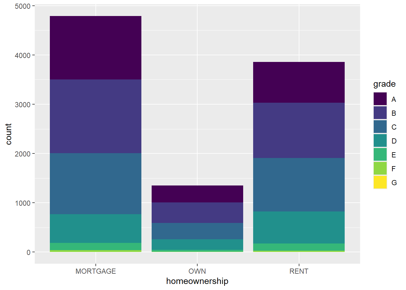
Segmented bar plot
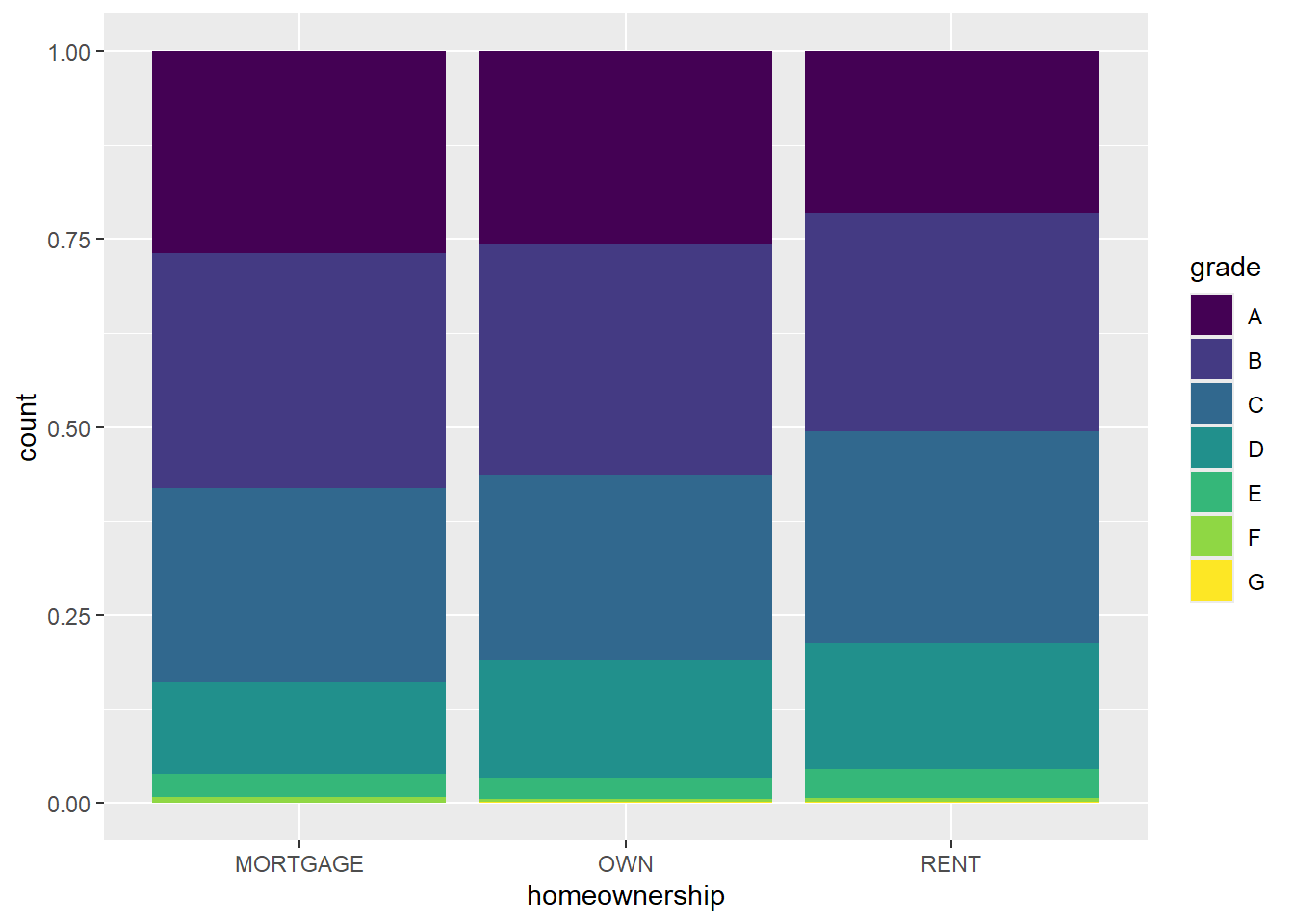
ggplot(loans, aes(x = homeownership, fill = grade)) +
  geom_bar(position = "fill")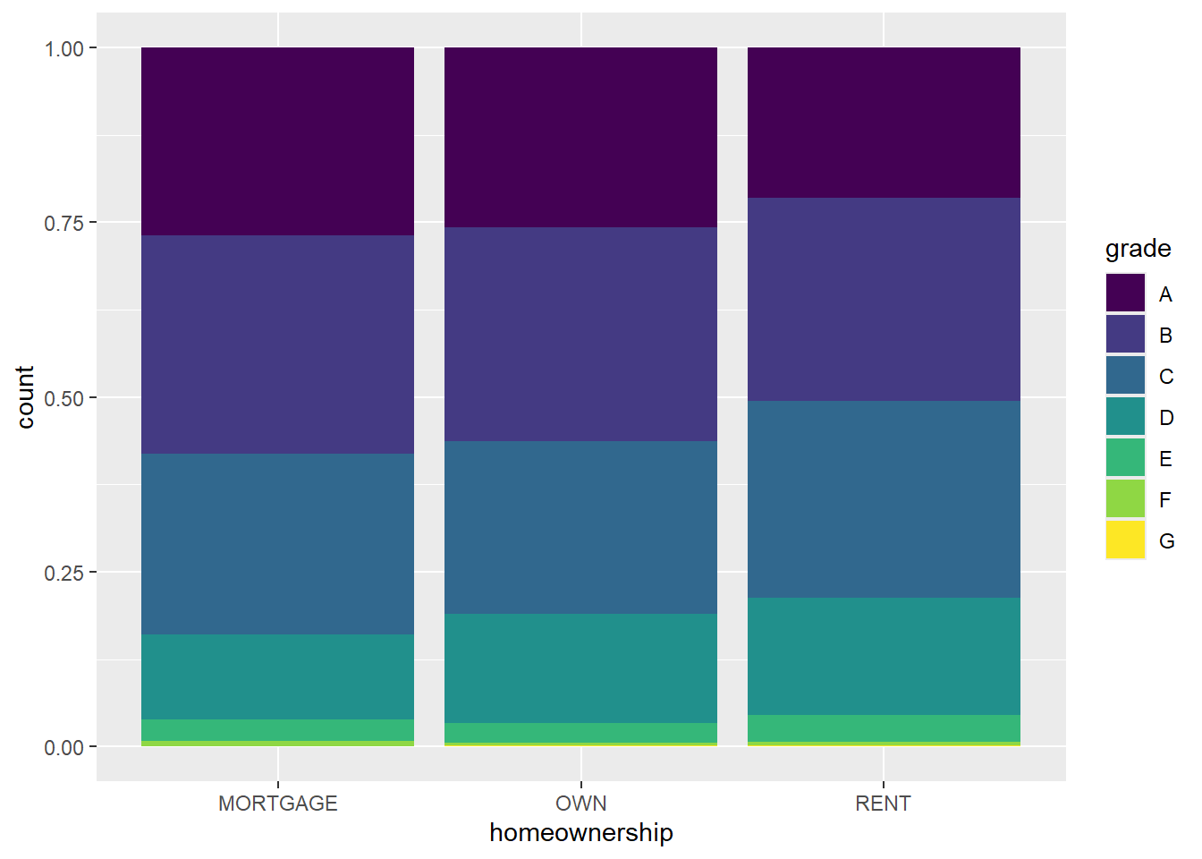
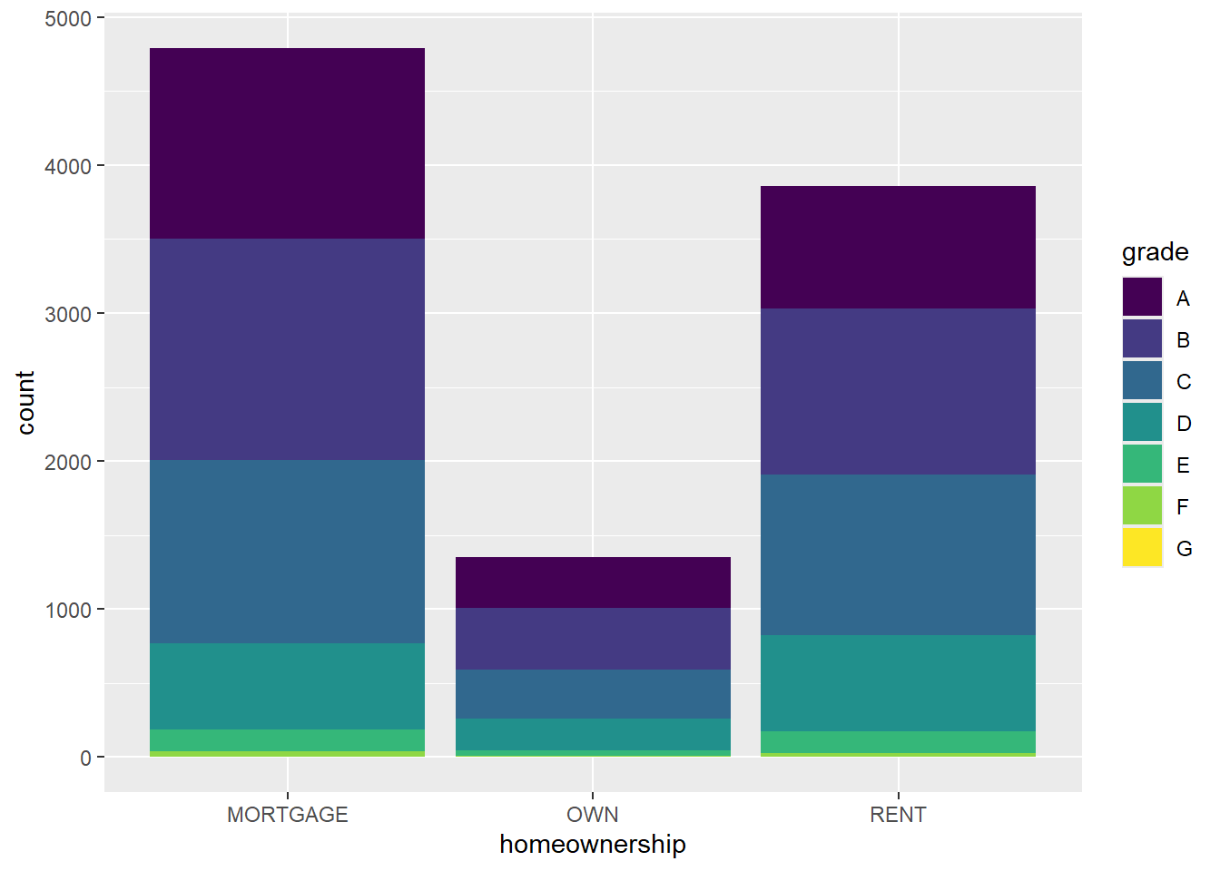
Which bar plot is a more useful representation for visualizing the relationship between homeownership and grade?
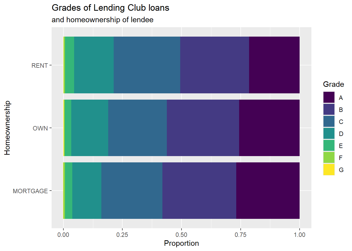
Customizing bar plots
ggplot(loans, aes(y = homeownership,
                  fill = grade)) +
  geom_bar(position = "fill") +
  labs(
    x = "Proportion",
    y = "Homeownership",
    fill = "Grade",
    title = "Grades of Lending Club loans",
    subtitle = "and homeownership of lendee"
  )
Relationships between numerical and categorical variables
Already talked about…
- Colouring and faceting histograms and density plots
- Side-by-side box plots
Violin plots
ggplot(loans, aes(x = homeownership, y = loan_amount)) +
  geom_violin()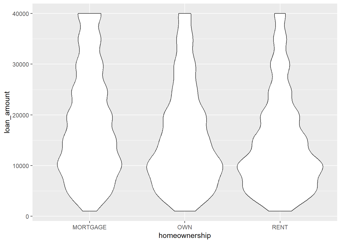
Ridge plots
library(ggridges)
ggplot(loans, aes(x = loan_amount, y = grade, fill = grade, color = grade)) +
  geom_density_ridges(alpha = 0.5)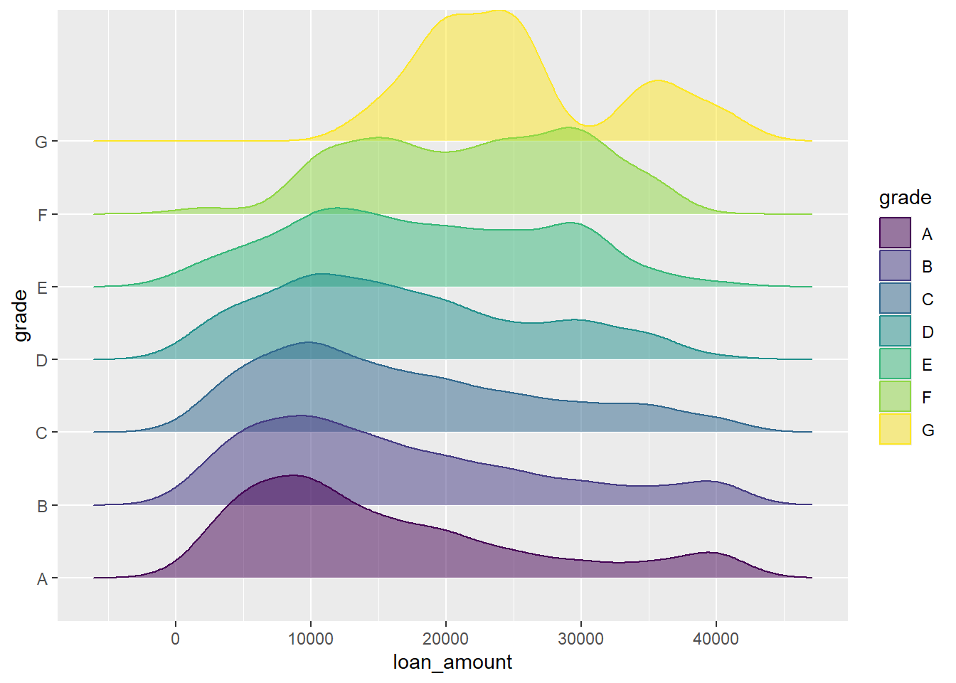
“Better” outputs
Note
Note this is Dr. D’s material, not part of the DS Box video. Read along, run the code and view the output. Then answer the “you try it” questions.
There are multiple ways to create plots, what was shown in this video is the “native” ggplot2 method. ggplot2 is fantastic and can be customized quite well. Many other packages have created custom displays of various plotting and table outputs, allowing for a well developed plot to be created with minimal code. Some of my favorite are:
Let’s walk through some of these “better” output formats.
Better Barcharts
Using the plot_frq function from the sjPlot package builds on the geom_bar() type plot from ggplot, but adds frequencies and relative percentages on the plot. Note that the variable name “homeownership” is being written using quotation marks.
plot_frq(loans, "homeownership")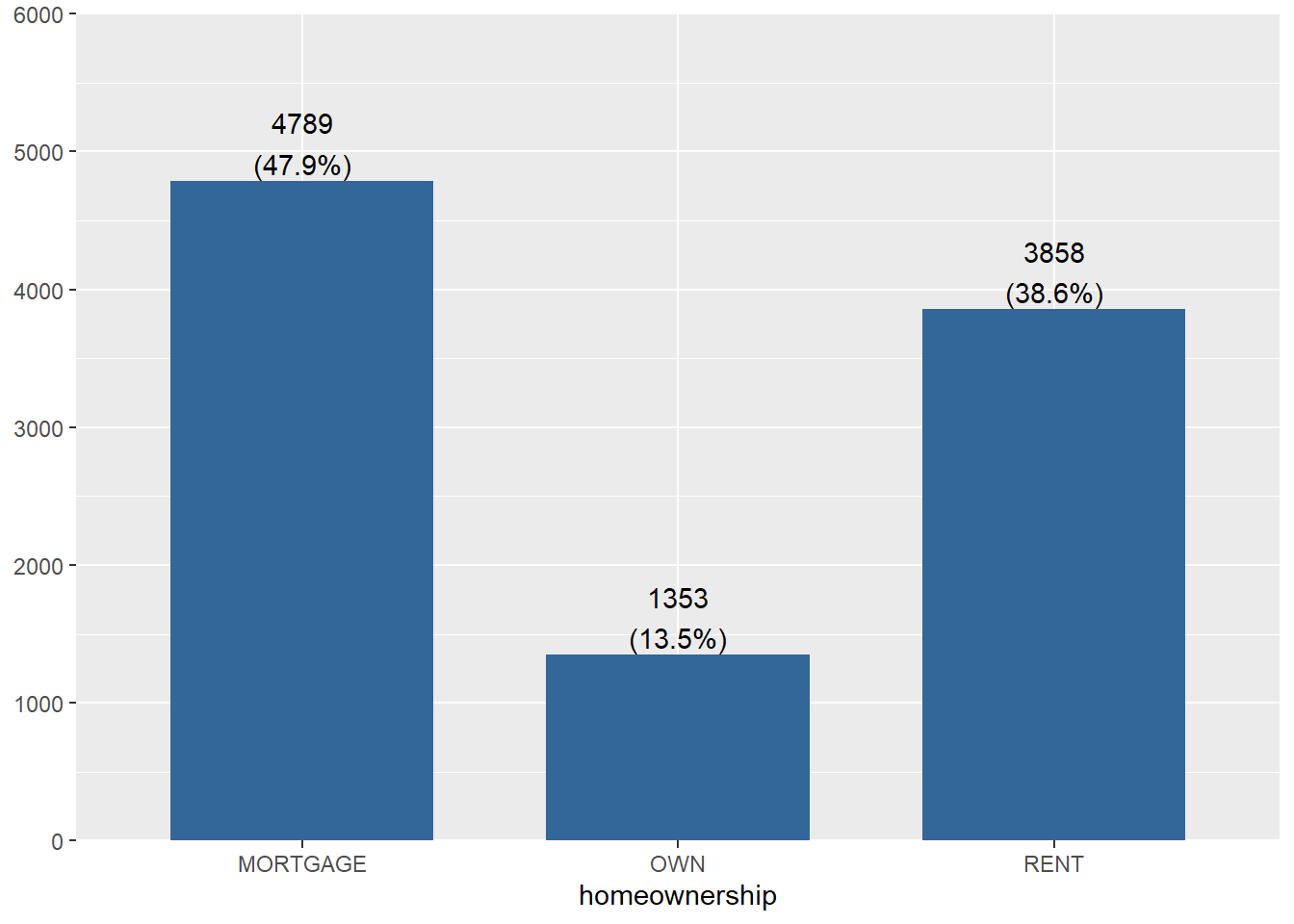
The plot_xtab function is the two-way table analogy to plot_frq to create a barchart with clear labels on the bars for the N and % (and NA values dropped). Note you have to use dollar sign notation here for the variables. Yea it’s not consistent.
plot_xtab(x = loans$homeownership, grp = loans$grade)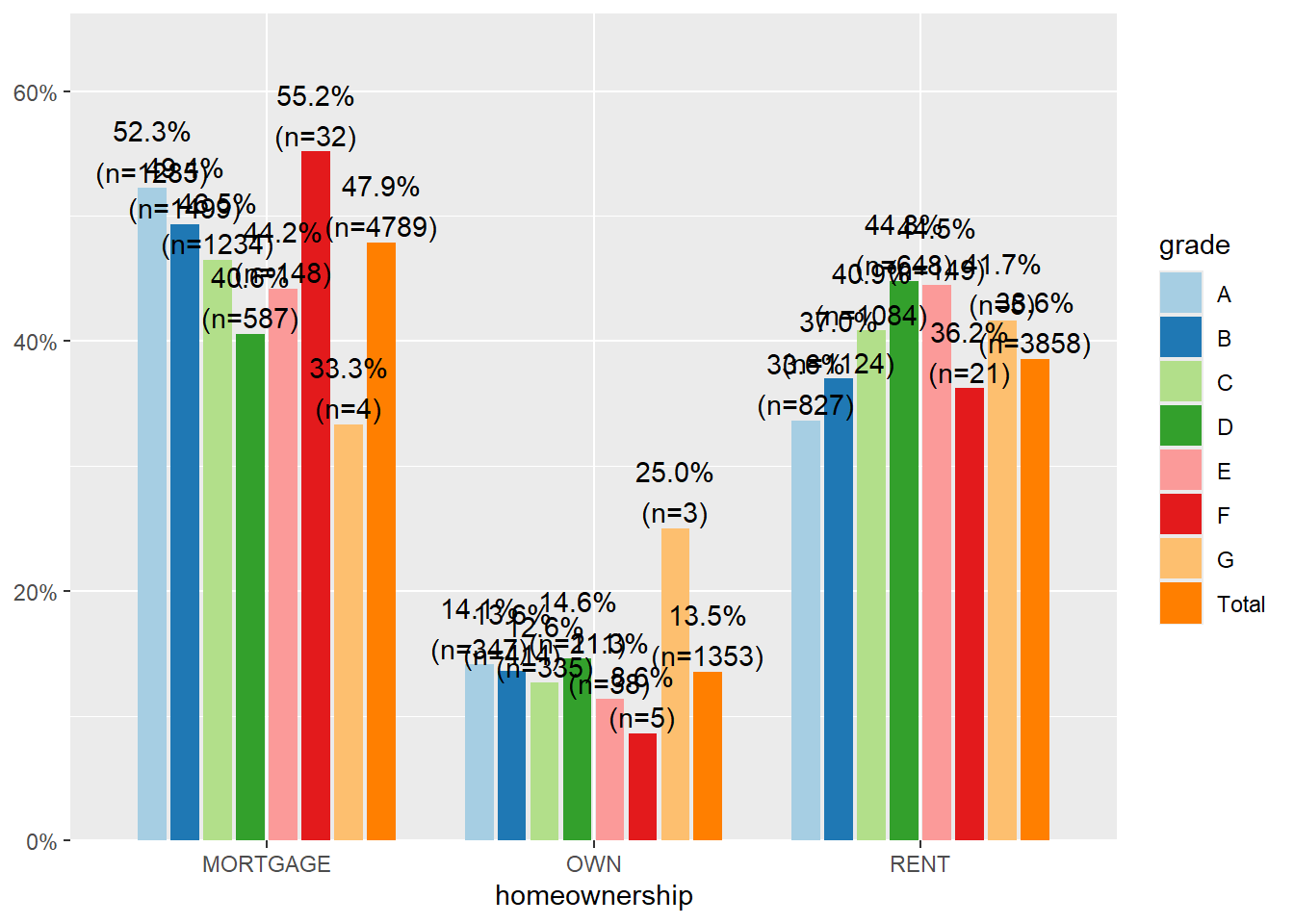
By default this plots the vertical axis as percents, not counts, and it shows the marginal total for the variable that’s on the x-axis. We can remove the total by setting show.total to false.
plot_xtab(x = loans$homeownership, grp = loans$grade, show.total = "false")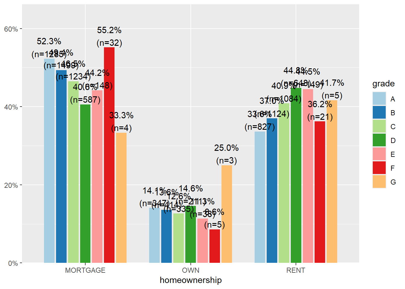
WarningYou Try It!
- Create a univariate bar plot of another categorical variable in the
loansdata set usingplot_frq - Create a bivariate comparison barplot of two categorical variables in the
loansdata set usingplot_xtab.
Better Distributions
The ggpubr package uses specific functions for each type of plot.
The gghistogram function makes a histogram very similar to the ggplot2 default, but with a different theme applied (different appearance).
gghistogram(loans, x = "loan_amount", title = "Basic")
gghistogram(loans, x = "loan_amount", fill = "lightgray", add = "mean", rug = TRUE, title = "Fancy")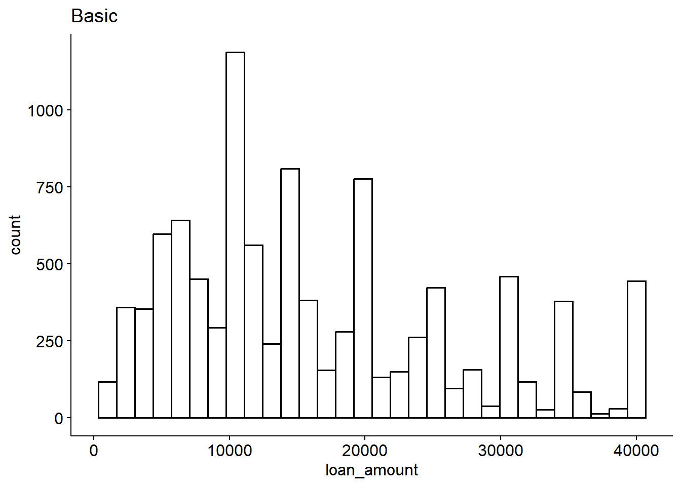
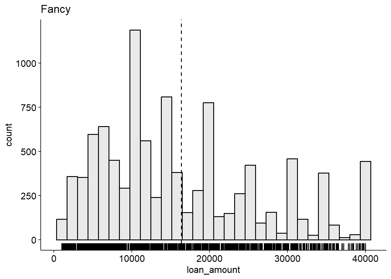
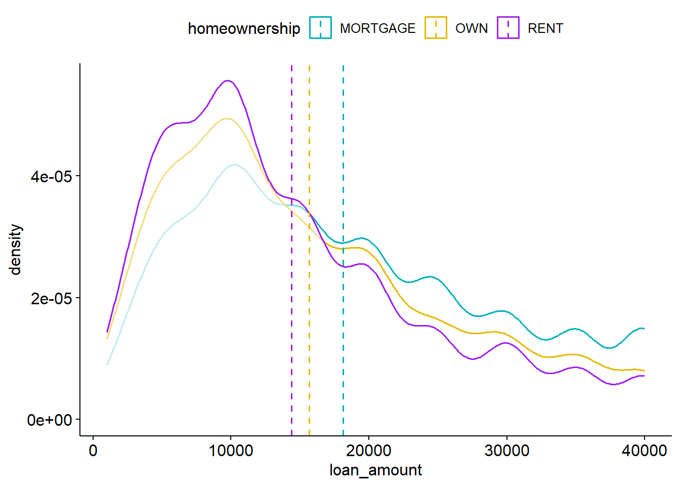
Similarly there is ggdensity
ggdensity(loans, x = "loan_amount", fill = "lightgray", add = "mean", rug = TRUE)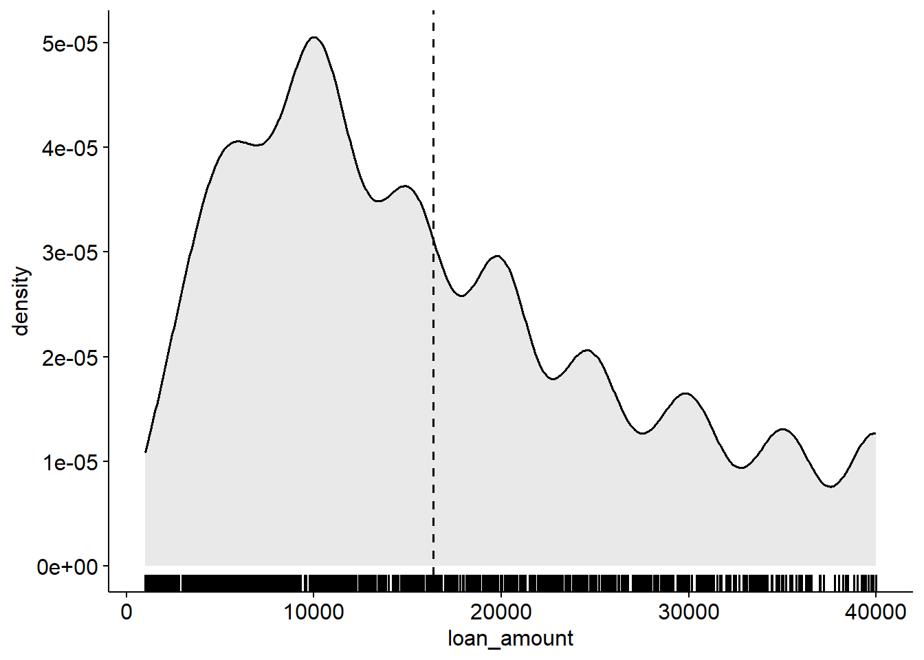
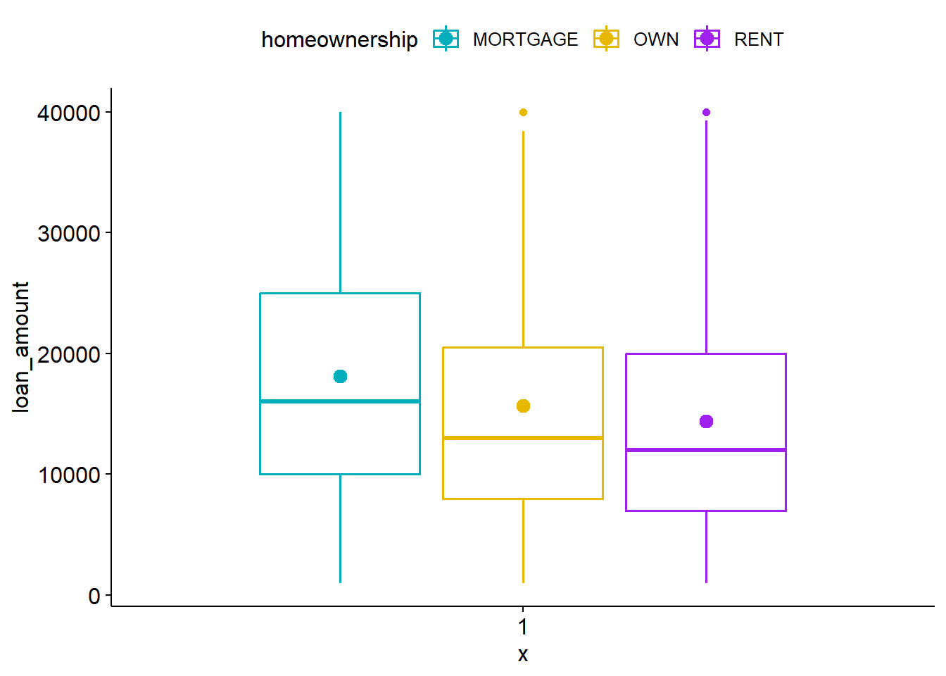
and ggboxplot (note it requires the numeric variable on the y axis).
ggboxplot(loans, y = "loan_amount", fill = "tan", add = "mean")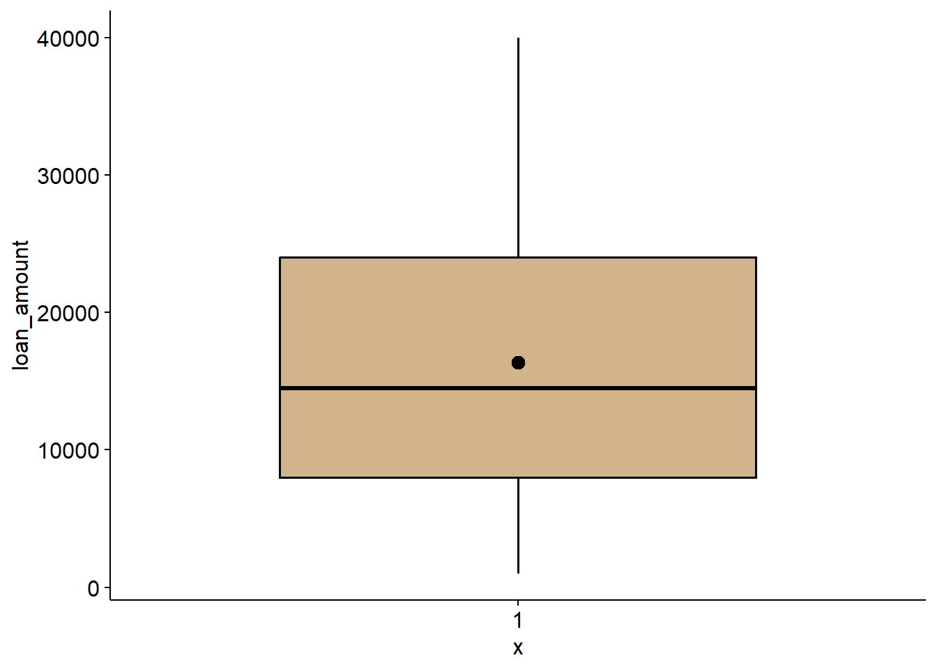
These functions really shine (imo) when you are comparing two variables:
gghistogram(loans, x = "loan_amount", add = "mean",
            color = "homeownership", fill = "homeownership",
            palette = c("#00AFBB", "#E7B800", "purple") )
ggdensity(loans, x = "loan_amount", color = "homeownership", add = "mean",
            palette = c("#00AFBB", "#E7B800", "purple"))
ggboxplot(loans, y = "loan_amount", color = "homeownership", add = "mean",
            palette = c("#00AFBB", "#E7B800", "purple"))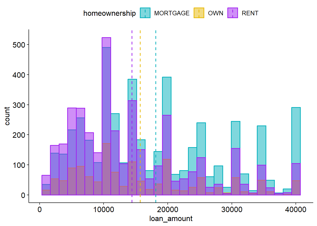
WarningYou Try It!
Compare the distribution of a numeric variable against a categorical variable using either gghistogram or ggdensity. Check out colors() and pick your own color palette.
Better Tables
The tbl_summary function out of gtsummary produces an extremely nicely formatted table of summary statistics for a data set.
Basic usage:
tbl_summary(loans, include = loan_amount)| Characteristic | N = 10,0001 |
|---|---|
| loan_amount | 14,500 (8,000, 24,000) |
| 1 Median (Q1, Q3) | |
tbl_summary(loans, include = homeownership)| Characteristic | N = 10,0001 |
|---|---|
| homeownership | |
| MORTGAGE | 4,789 (48%) |
| OWN | 1,353 (14%) |
| RENT | 3,858 (39%) |
| 1 n (%) | |
But you can customize what summary statistics get displayed:
tbl_summary(loans,
            include = c(homeownership, loan_amount),
            statistic = list(
                all_continuous() ~ "{mean} ({sd})",
                all_categorical() ~ "{n} ({p}%)"
              )
)| Characteristic | N = 10,0001 |
|---|---|
| homeownership | |
| MORTGAGE | 4,789 (48%) |
| OWN | 1,353 (14%) |
| RENT | 3,858 (39%) |
| loan_amount | 16,362 (10,302) |
| 1 n (%); Mean (SD) | |
We’ll come back to tbl_summary again in the semester when calculating grouped summary statistics, and displaying regression results.
WarningYou Try It!
Create a summary table of one numeric and one categorical variable.
This page adapts material from Data Science in a Box (Unit 2, Deck 4: “Visualising categorical data”) by Mine Çetinkaya-Rundel, licensed under CC BY-SA 4.0. Source: tidyverse/datascience-box. Modified: reorganized into a single Quarto page; the “Better outputs” section (sjPlot/gtsummary/ggpubr) is original material, not part of the DS Box deck.