library(tidyverse)
library(palmerpenguins)Visualising data with ggplot2
wk2-d02-ggplot2
ggplot2 💕🐧
Setup
🎥 ggplot2 (21 min) - code along in wk2-d02
ggplot2 is part of the tidyverse
- ggplot2 is tidyverse’s data visualization package
- Structure of the code for plots can be summarized as
ggplot(data = [dataset],
       mapping = aes(x = [x-variable],
                     y = [y-variable])) +
   geom_xxx() +
   other options
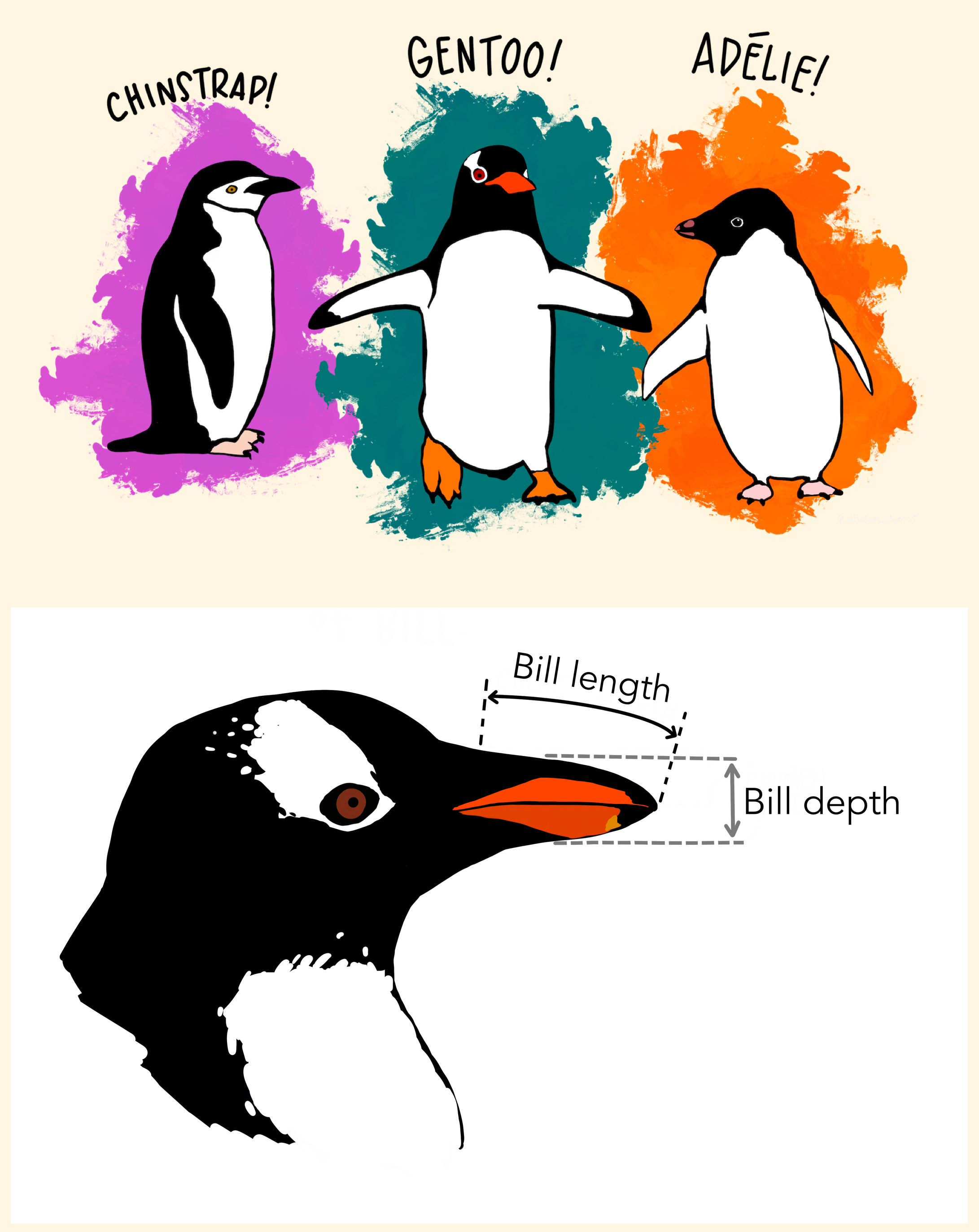
Data: Palmer Penguins
Measurements for penguin species, island in Palmer Archipelago, size (flipper length, body mass, bill dimensions), and sex.
library(palmerpenguins)
glimpse(penguins)
Rows: 344
Columns: 8
$ species <fct> Adelie, Adelie, Adelie, Adelie, Adelie, Ad…
$ island <fct> Torgersen, Torgersen, Torgersen, Torgersen…
$ bill_length_mm <dbl> 39.1, 39.5, 40.3, NA, 36.7, 39.3, 38.9, 39…
$ bill_depth_mm <dbl> 18.7, 17.4, 18.0, NA, 19.3, 20.6, 17.8, 19…
$ flipper_length_mm <int> 181, 186, 195, NA, 193, 190, 181, 195, 193…
$ body_mass_g <int> 3750, 3800, 3250, NA, 3450, 3650, 3625, 46…
$ sex <fct> male, female, female, NA, female, male, fe…
$ year <int> 2007, 2007, 2007, 2007, 2007, 2007, 2007, …Bill depth and length
ggplot(data = penguins,
       mapping = aes(x = bill_depth_mm, y = bill_length_mm,
                     colour = species)) +
  geom_point() +
  labs(title = "Bill depth and length",
       subtitle = "Dimensions for Adelie, Chinstrap, and Gentoo Penguins",
       x = "Bill depth (mm)", y = "Bill length (mm)",
       colour = "Species")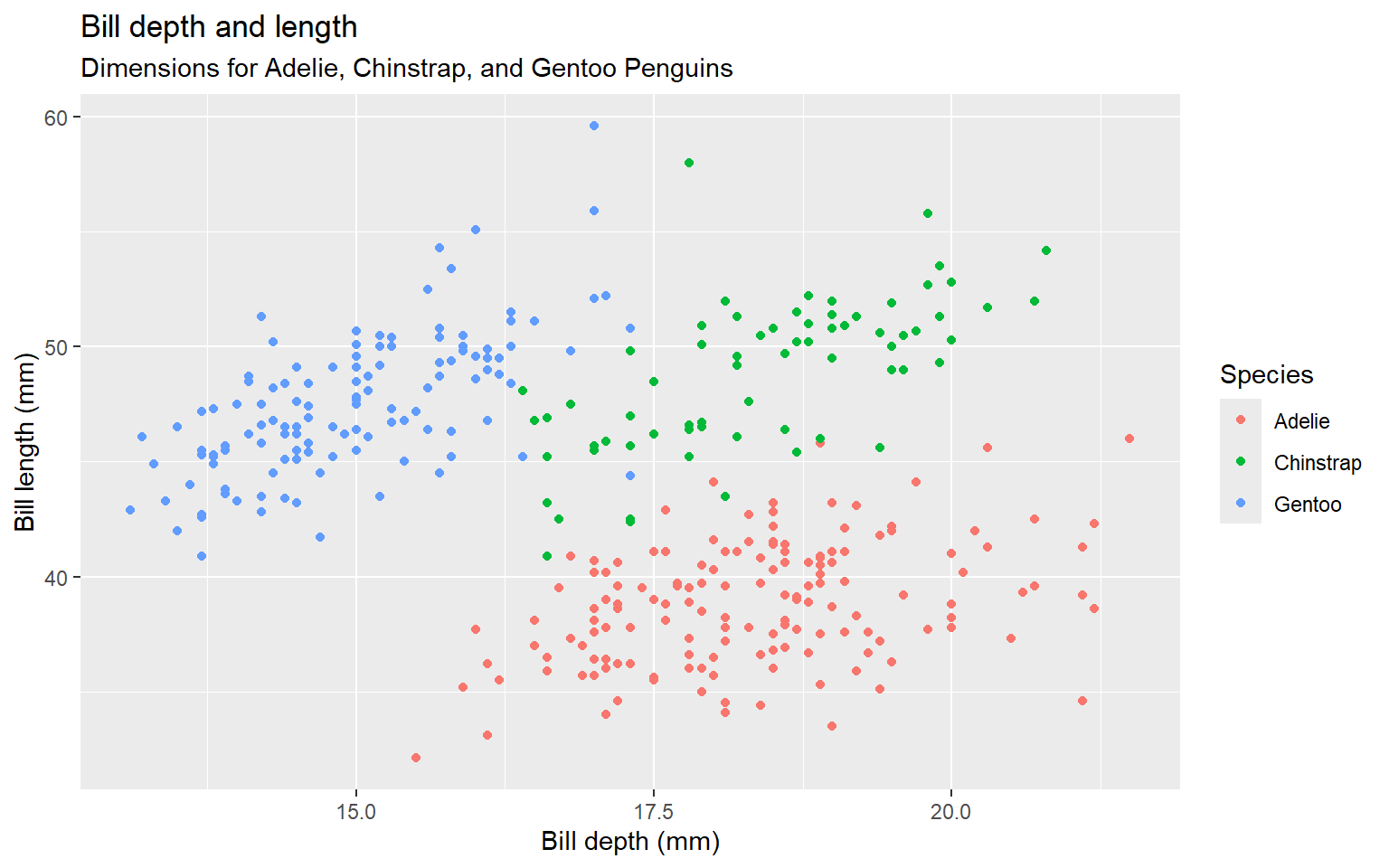
Coding out loud
Start with the penguins data frame
ggplot(data = penguins)
Map bill depth to the x-axis
Start with the
penguinsdata frame, map bill depth to the x-axis
ggplot(data = penguins,
       mapping = aes(x = bill_depth_mm))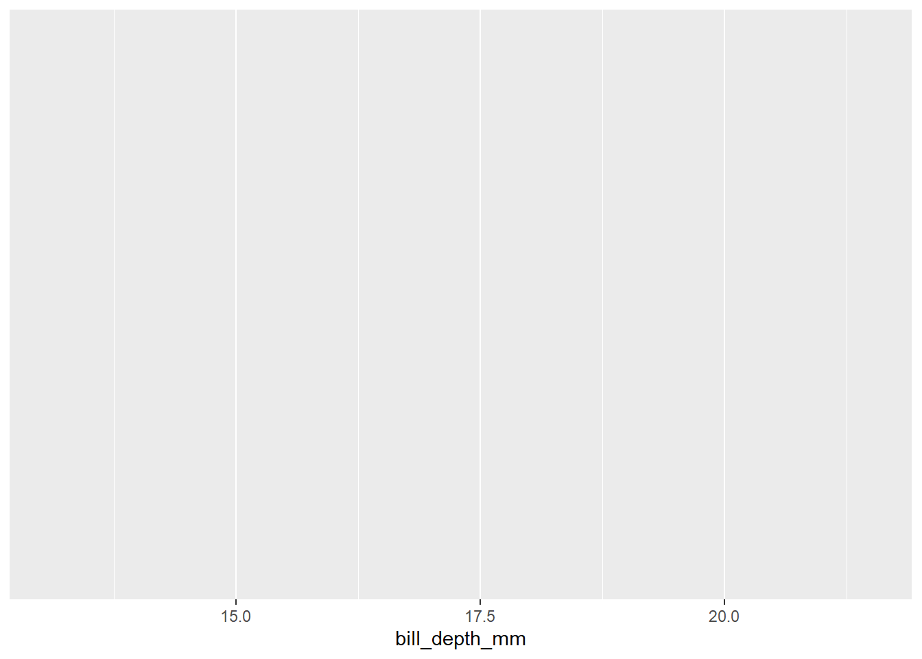
Map bill length to the y-axis
…and map bill length to the y-axis.
ggplot(data = penguins,
       mapping = aes(x = bill_depth_mm,
                     y = bill_length_mm))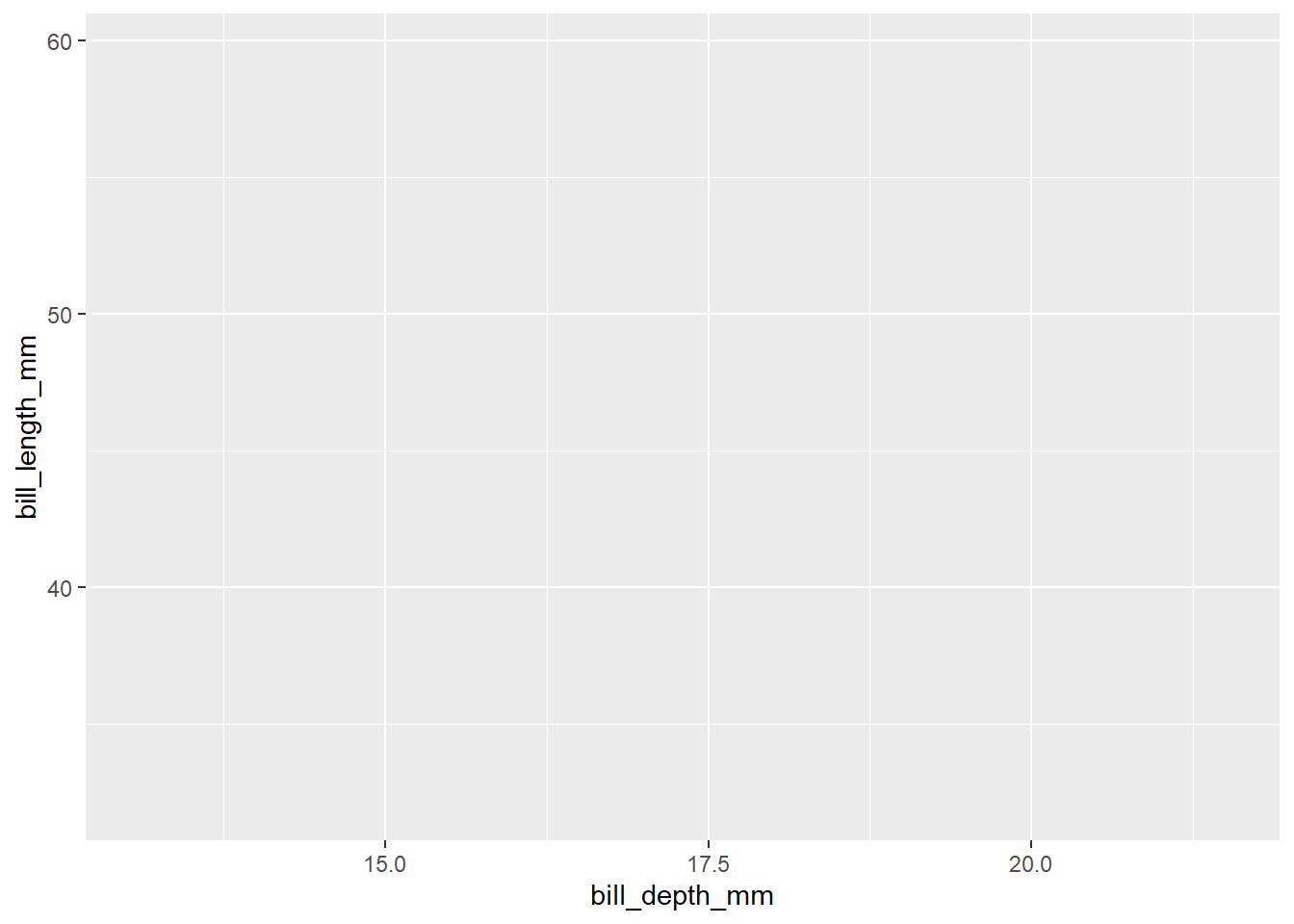
Represent each observation with a point
ggplot(data = penguins,
       mapping = aes(x = bill_depth_mm,
                     y = bill_length_mm)) +
  geom_point()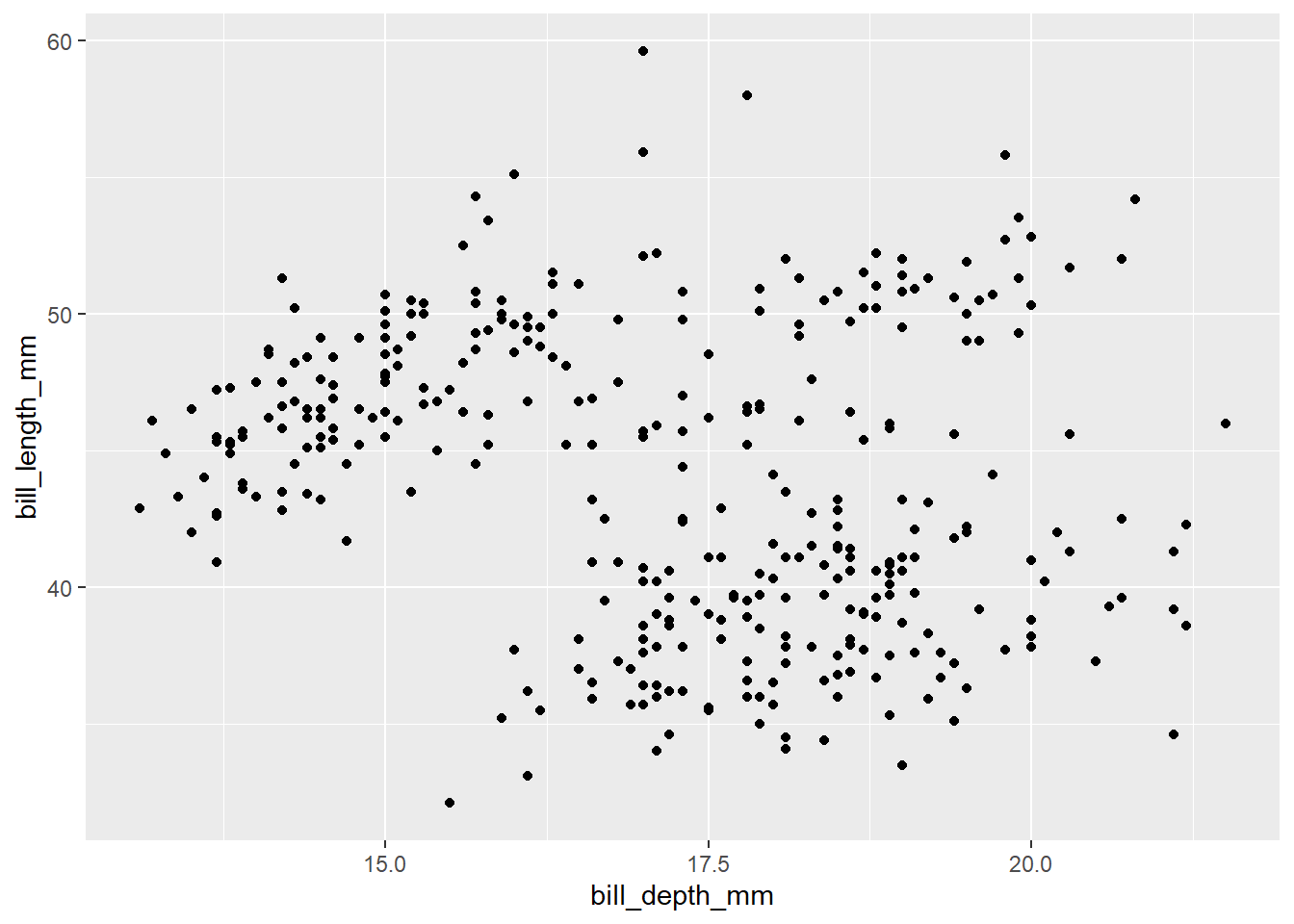
Map species to the colour of each point
ggplot(data = penguins,
       mapping = aes(x = bill_depth_mm,
                     y = bill_length_mm,
                     colour = species)) +
  geom_point()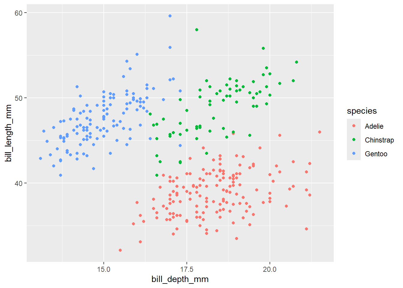
Title the plot “Bill depth and length”
ggplot(data = penguins,
       mapping = aes(x = bill_depth_mm,
                     y = bill_length_mm,
                     colour = species)) +
  geom_point() +
  labs(title = "Bill depth and length")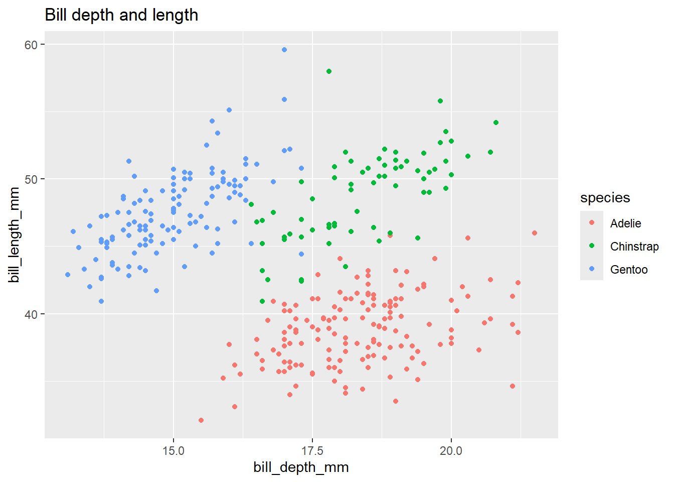
Add the subtitle “Dimensions for Adelie, Chinstrap, and Gentoo Penguins”
ggplot(data = penguins,
       mapping = aes(x = bill_depth_mm,
                     y = bill_length_mm,
                     colour = species)) +
  geom_point() +
  labs(title = "Bill depth and length",
       subtitle = "Dimensions for Adelie, Chinstrap, and Gentoo Penguins")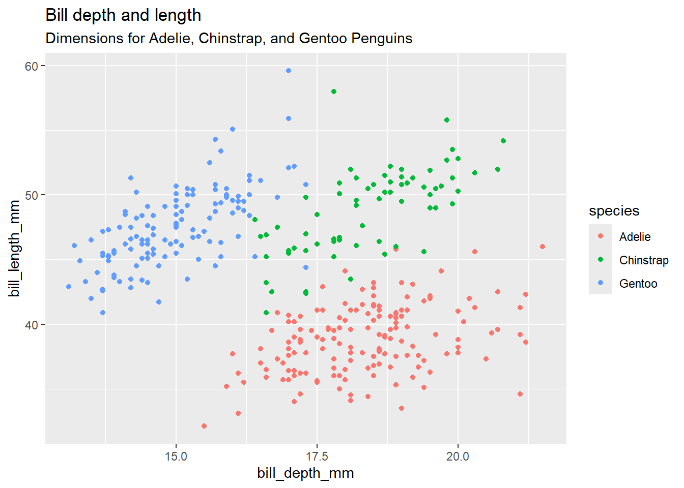
Label the x and y axes
ggplot(data = penguins,
       mapping = aes(x = bill_depth_mm,
                     y = bill_length_mm,
                     colour = species)) +
  geom_point() +
  labs(title = "Bill depth and length",
       subtitle = "Dimensions for Adelie, Chinstrap, and Gentoo Penguins",
       x = "Bill depth (mm)", y = "Bill length (mm)")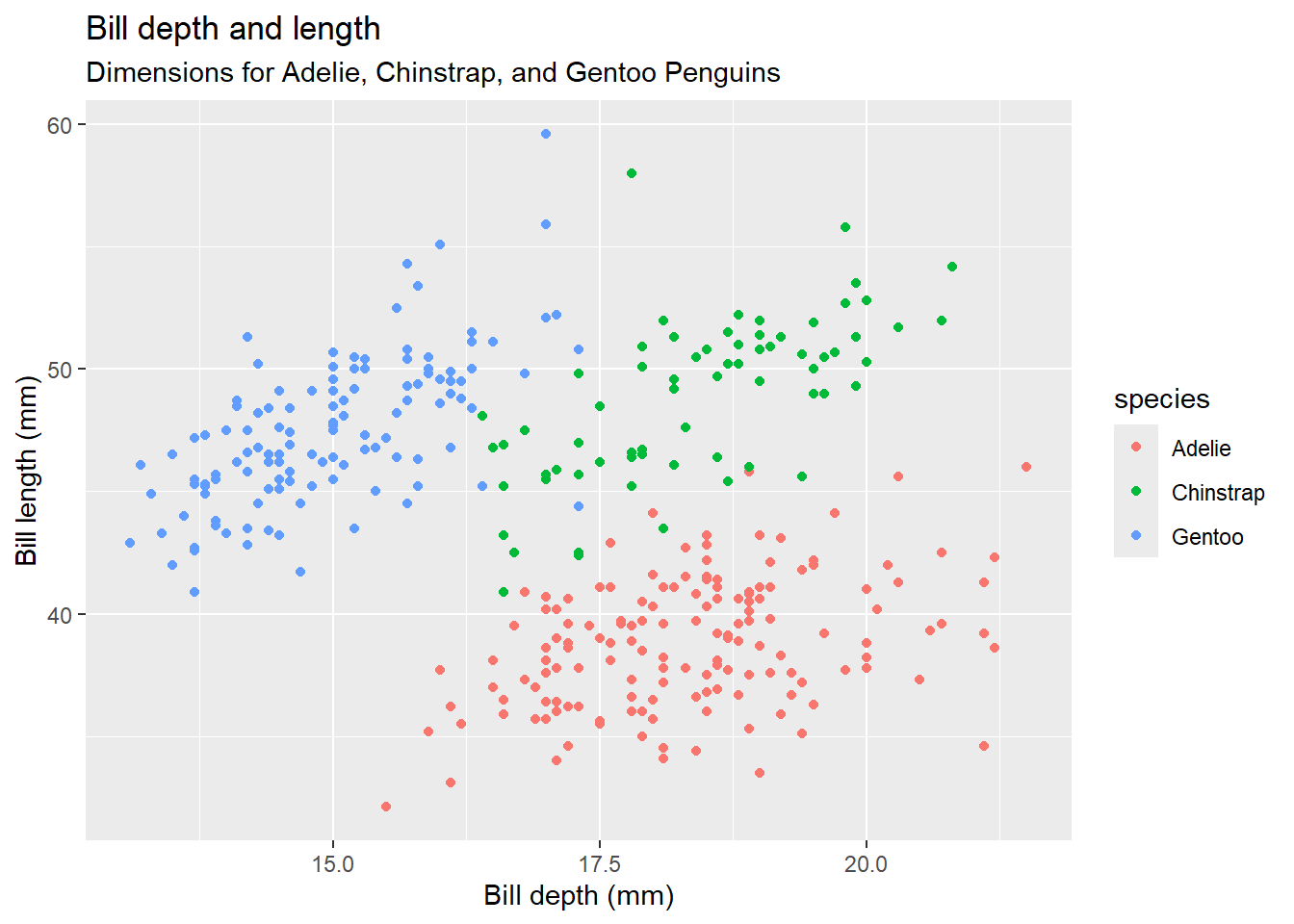
Label the legend “Species”
ggplot(data = penguins,
       mapping = aes(x = bill_depth_mm,
                     y = bill_length_mm,
                     colour = species)) +
  geom_point() +
  labs(title = "Bill depth and length",
       subtitle = "Dimensions for Adelie, Chinstrap, and Gentoo Penguins",
       x = "Bill depth (mm)", y = "Bill length (mm)",
       colour = "Species")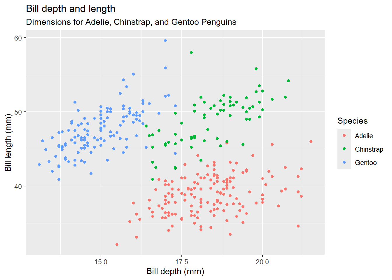
Add a caption for the data source
ggplot(data = penguins,
       mapping = aes(x = bill_depth_mm,
                     y = bill_length_mm,
                     colour = species)) +
  geom_point() +
  labs(title = "Bill depth and length",
       subtitle = "Dimensions for Adelie, Chinstrap, and Gentoo Penguins",
       x = "Bill depth (mm)", y = "Bill length (mm)",
       colour = "Species",
       caption = "Source: Palmer Station LTER / palmerpenguins package")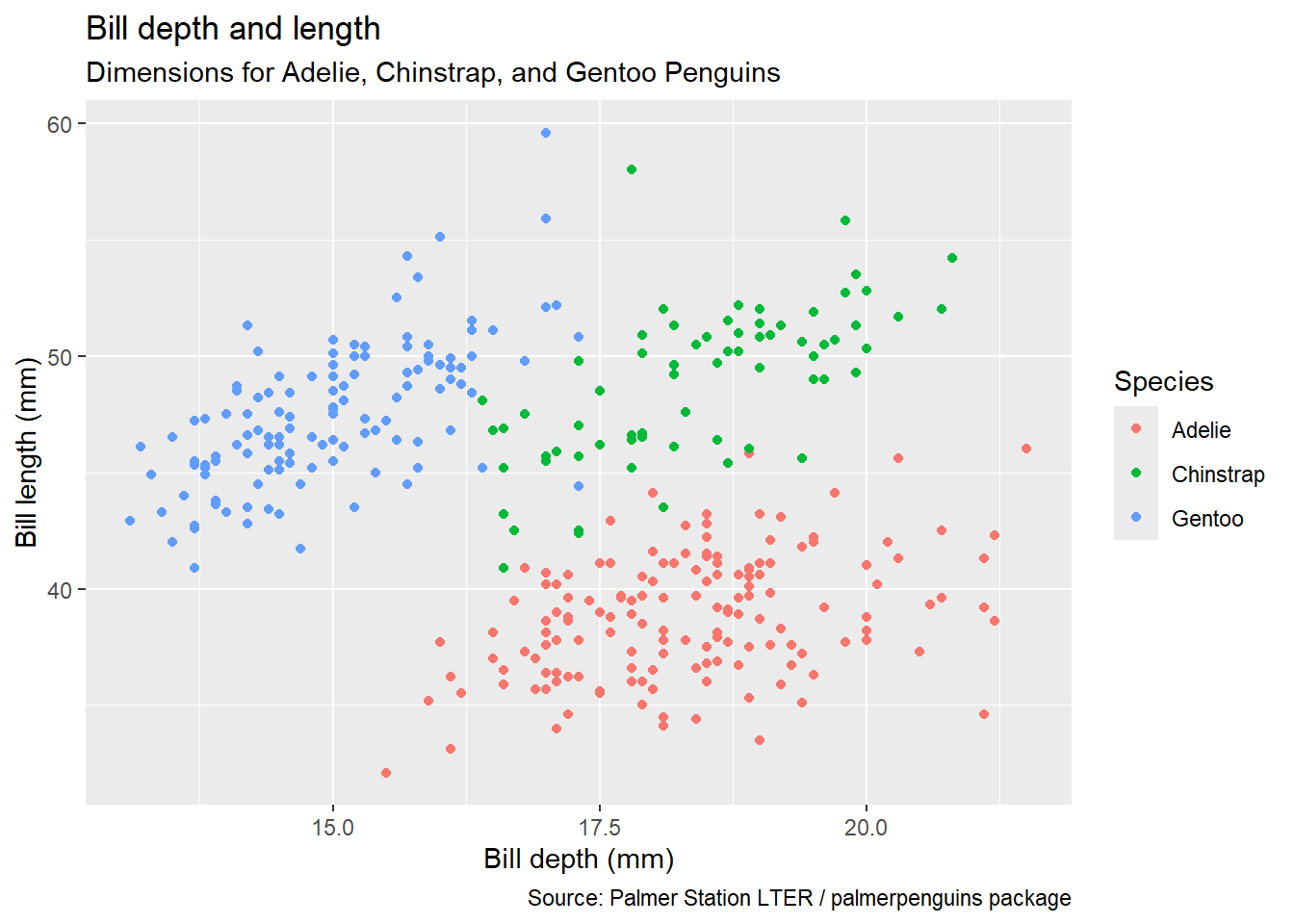
Use a colour-blind-safe palette
Finally, use a discrete colour scale that is designed to be perceived by viewers with common forms of colour blindness.
ggplot(data = penguins,
       mapping = aes(x = bill_depth_mm,
                     y = bill_length_mm,
                     colour = species)) +
  geom_point() +
  labs(title = "Bill depth and length",
       subtitle = "Dimensions for Adelie, Chinstrap, and Gentoo Penguins",
       x = "Bill depth (mm)", y = "Bill length (mm)",
       colour = "Species",
       caption = "Source: Palmer Station LTER / palmerpenguins package") +
  scale_colour_viridis_d()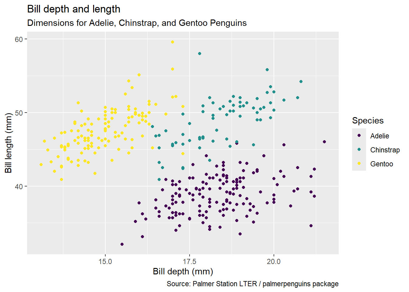
Putting it all together
Start with the penguins data frame, map bill depth to the x-axis and map bill length to the y-axis. Represent each observation with a point and map species to the colour of each point. Title the plot “Bill depth and length”, add the subtitle “Dimensions for Adelie, Chinstrap, and Gentoo Penguins”, label the x and y axes as “Bill depth (mm)” and “Bill length (mm)”, respectively, label the legend “Species”, and add a caption for the data source. Finally, use a discrete colour scale that is designed to be perceived by viewers with common forms of colour blindness.
ggplot(data = penguins,
       mapping = aes(x = bill_depth_mm,
                     y = bill_length_mm,
                     colour = species)) +
  geom_point() +
  labs(title = "Bill depth and length",
       subtitle = "Dimensions for Adelie, Chinstrap, and Gentoo Penguins",
       x = "Bill depth (mm)", y = "Bill length (mm)",
       colour = "Species",
       caption = "Source: Palmer Station LTER / palmerpenguins package") +
  scale_colour_viridis_d()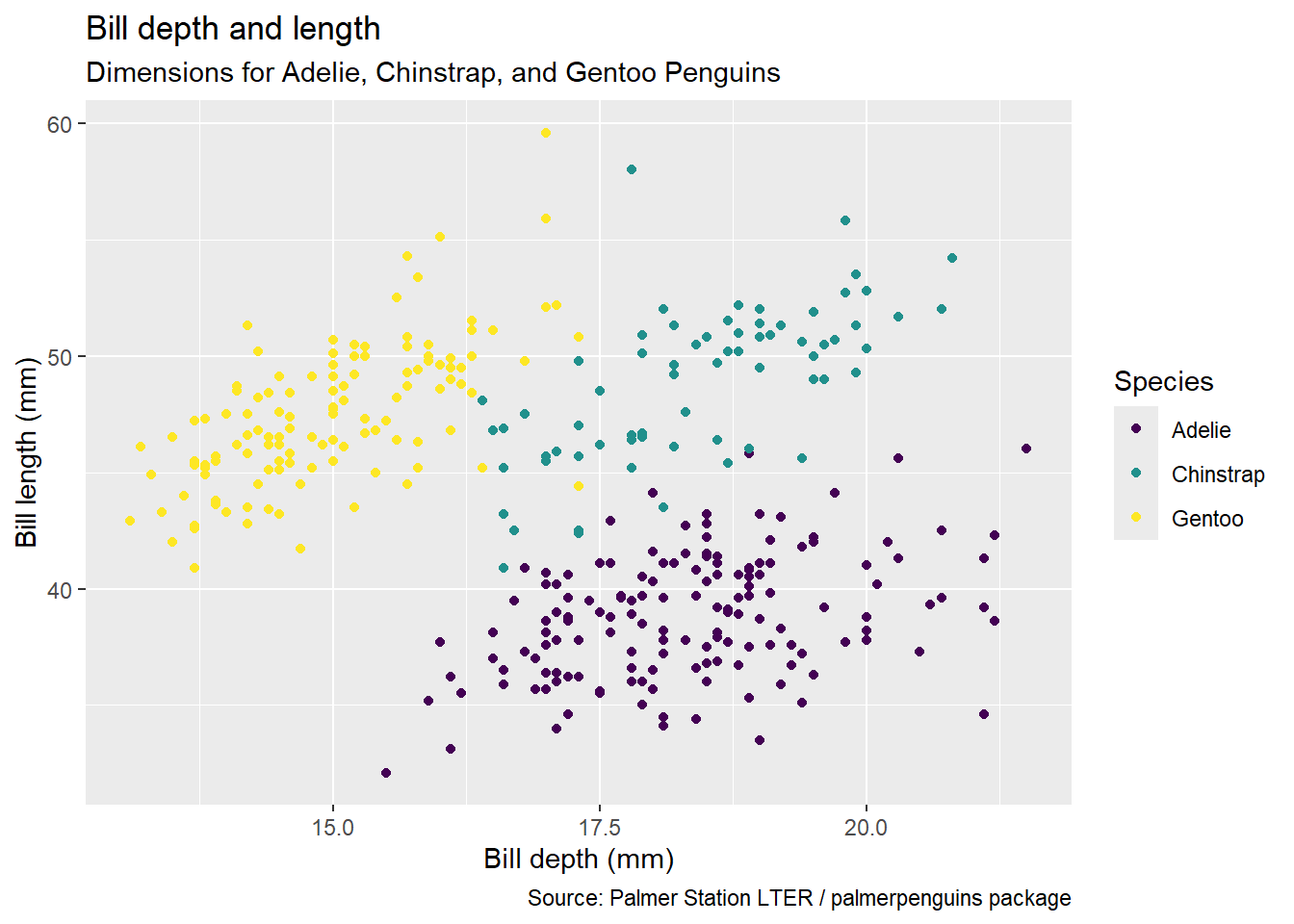
Argument names
You can omit the names of first two arguments when building plots with ggplot().
ggplot(data = penguins,
       mapping = aes(x = bill_depth_mm,
                     y = bill_length_mm,
                     colour = species)) +
  geom_point() +
scale_colour_viridis_d()ggplot(penguins,
aes(x = bill_depth_mm,
y = bill_length_mm,
colour = species)) +
geom_point() +
scale_colour_viridis_d()Aesthetics
Aesthetics options
Commonly used characteristics of plotting characters that can be mapped to a specific variable in the data are
colourshapesizealpha(transparency)
Colour
ggplot(penguins,
       aes(x = bill_depth_mm,
           y = bill_length_mm,
           colour = species)) +
  geom_point() +
  scale_colour_viridis_d()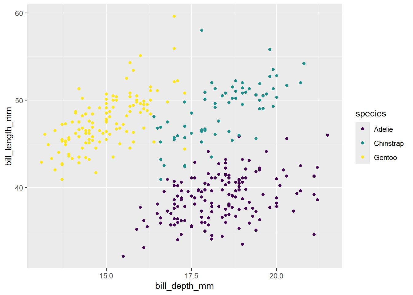
Shape
Mapped to a different variable than colour
ggplot(penguins,
       aes(x = bill_depth_mm,
           y = bill_length_mm,
           colour = species,
           shape = island)) +
  geom_point() +
  scale_colour_viridis_d()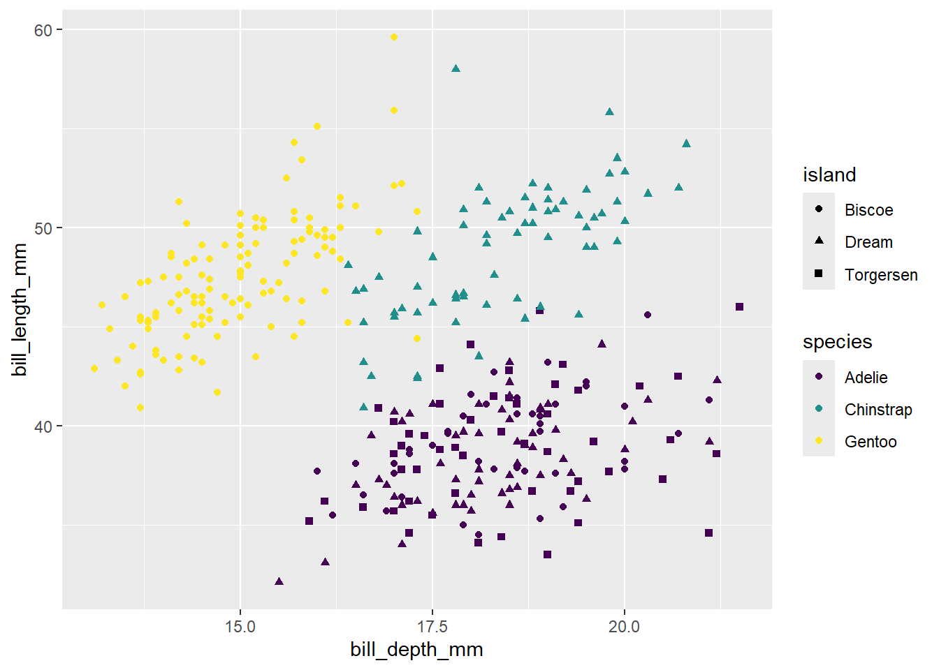
Shape
Mapped to the same variable as colour
ggplot(penguins,
       aes(x = bill_depth_mm,
           y = bill_length_mm,
           colour = species,
           shape = species)) +
  geom_point() +
  scale_colour_viridis_d()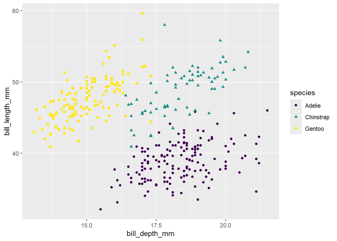
Size
ggplot(penguins,
       aes(x = bill_depth_mm,
           y = bill_length_mm,
           colour = species,
           shape = species,
           size = body_mass_g)) +
  geom_point() +
  scale_colour_viridis_d()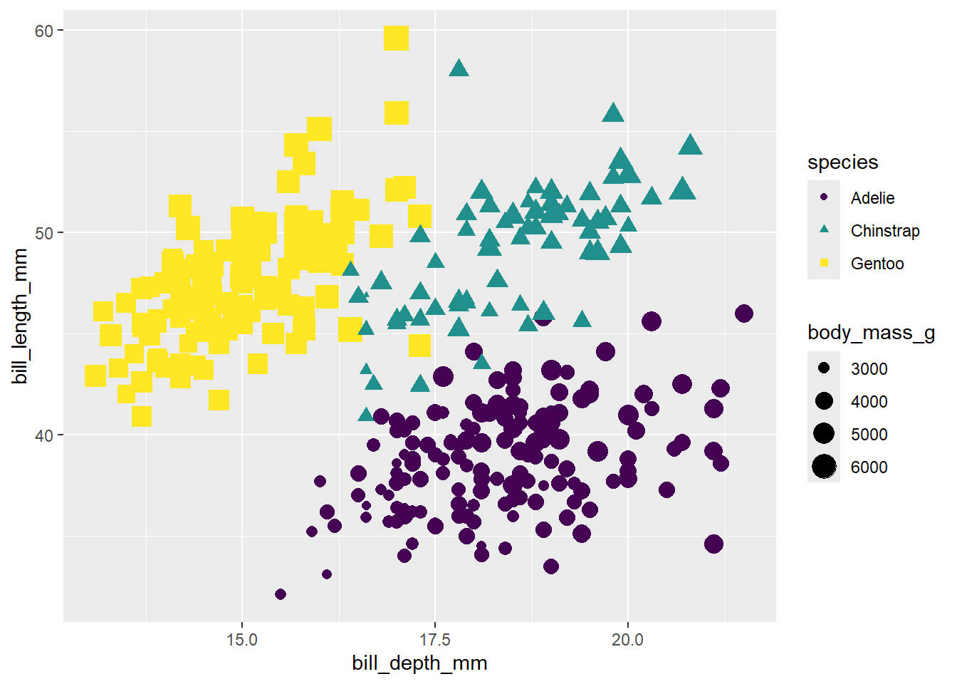
Alpha
ggplot(penguins,
       aes(x = bill_depth_mm,
           y = bill_length_mm,
           colour = species,
           shape = species,
           size = body_mass_g,
           alpha = flipper_length_mm)) +
  geom_point() +
  scale_colour_viridis_d()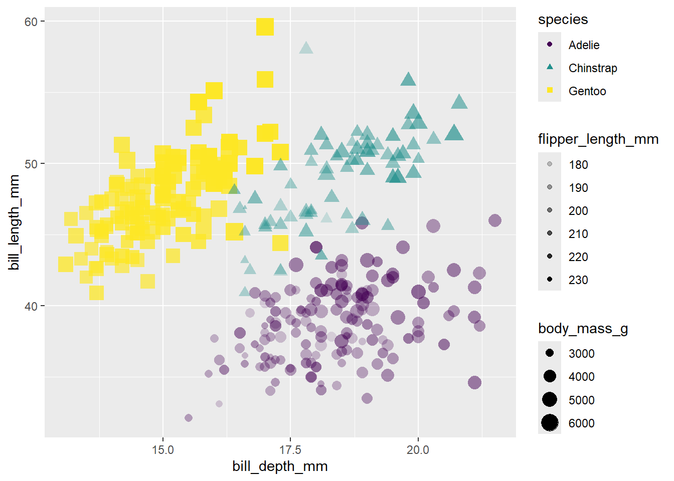
Mapping vs. setting
Mapping
ggplot(penguins,
       aes(x = bill_depth_mm,
           y = bill_length_mm,
           size = body_mass_g,
           alpha = flipper_length_mm)) +
  geom_point()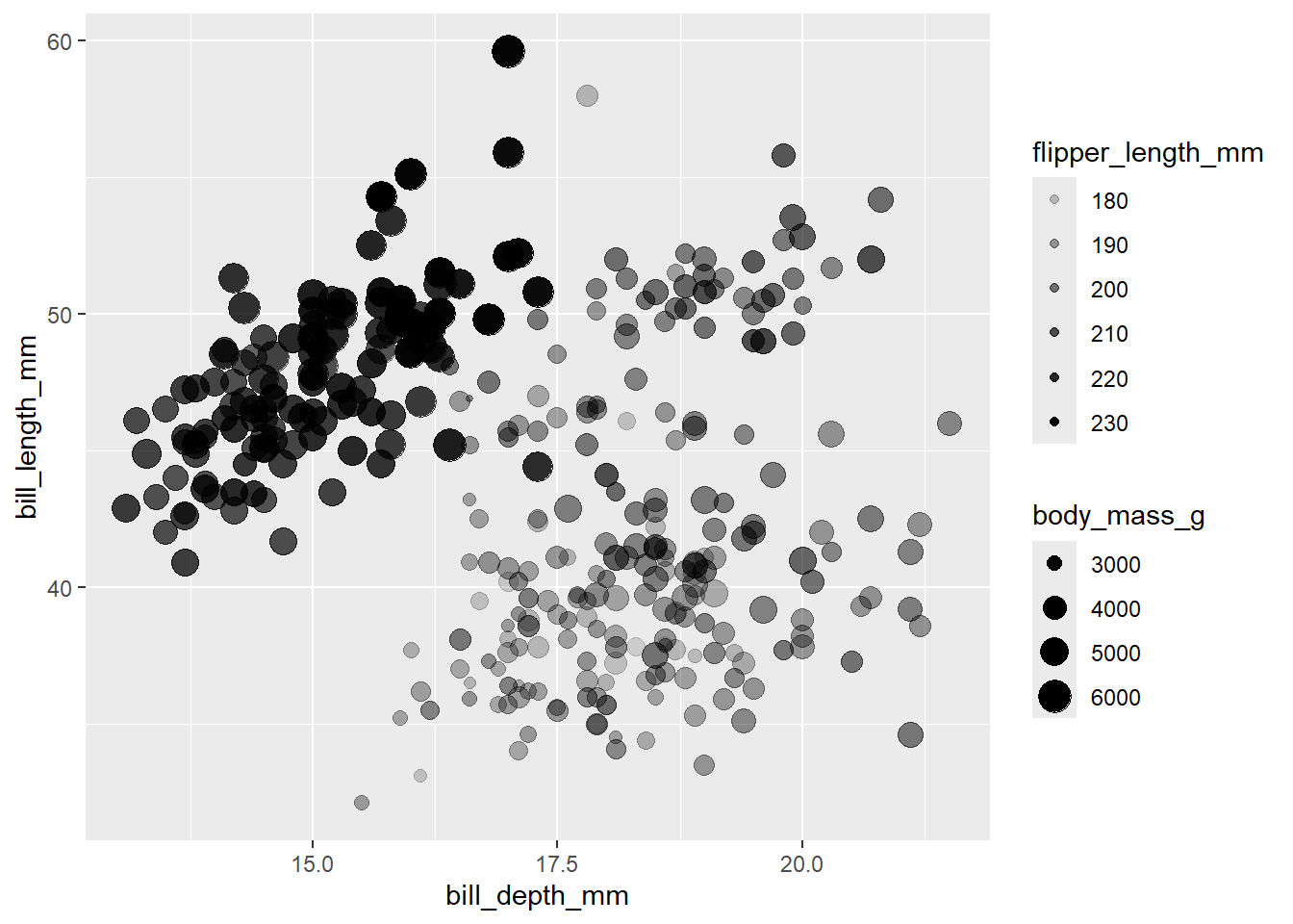
Setting
ggplot(penguins,
       aes(x = bill_depth_mm,
           y = bill_length_mm)) +
  geom_point(size = 2, alpha = 0.5)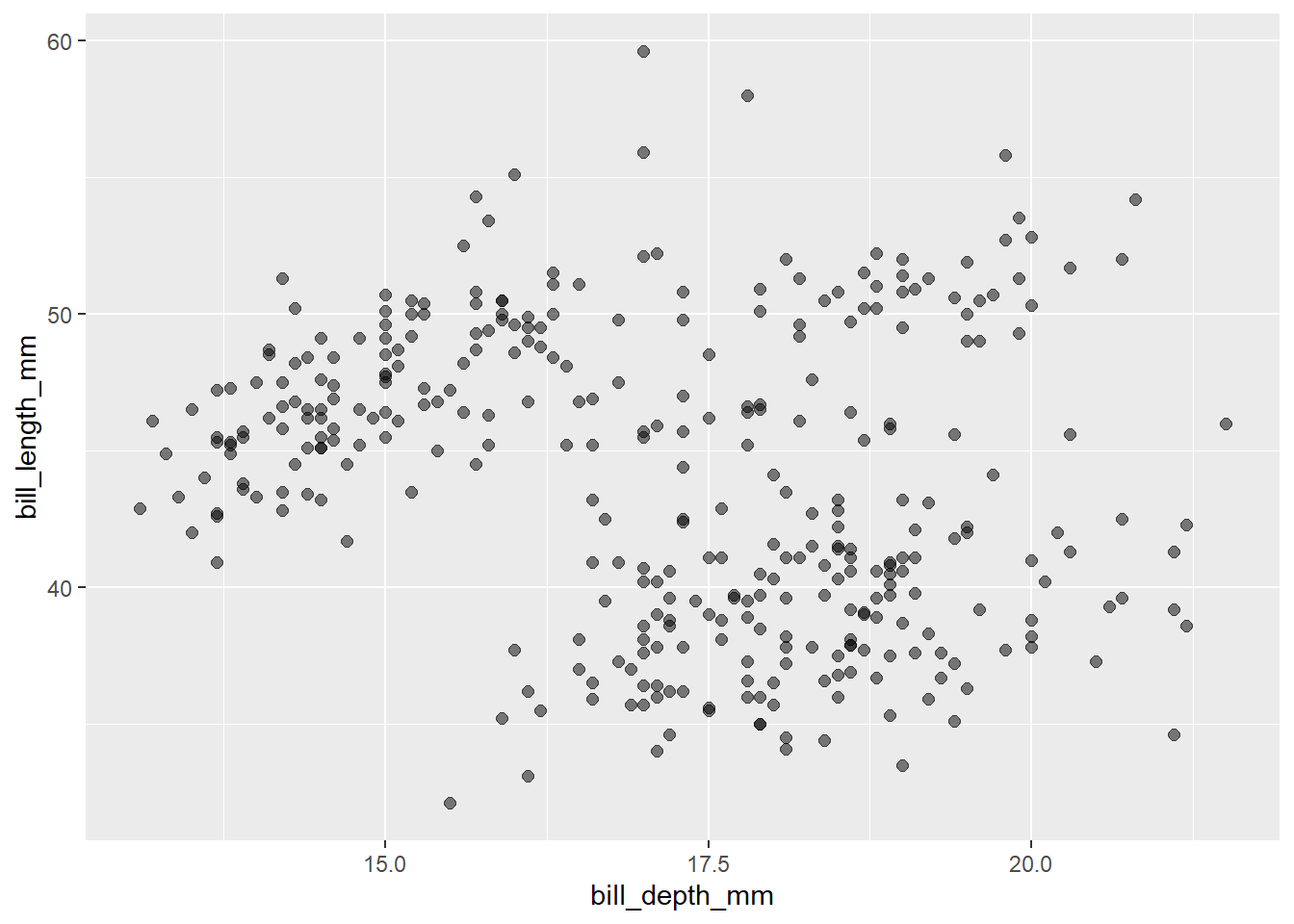
- Mapping: Determine the size, alpha, etc. of points based on the values of a variable in the data
- goes into
aes()
- goes into
- Setting: Determine the size, alpha, etc. of points not based on the values of a variable in the data
- goes into
geom_*()(this wasgeom_point()in the previous example, but we’ll learn about other geoms soon!)
- goes into
Faceting
Faceting
- Smaller plots that display different subsets of the data
- Useful for exploring conditional relationships and large data
#| out-width: "70%"
ggplot(penguins, aes(x = bill_depth_mm, y = bill_length_mm)) +
  geom_point() +
  facet_grid(species ~ island)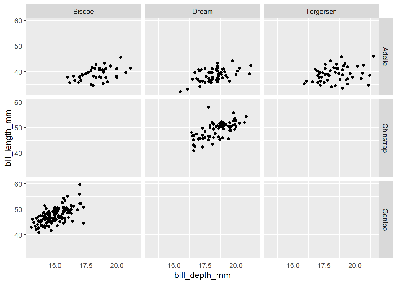
Various ways to facet
In the next few plots, think about how the code relates to the output. Note: the plots below do not have proper titles, axis labels, etc. because the point is to figure out what’s happening in the plot – but you should always label your plots!
ggplot(penguins, aes(x = bill_depth_mm, y = bill_length_mm)) +
  geom_point() +
  facet_grid(species ~ sex)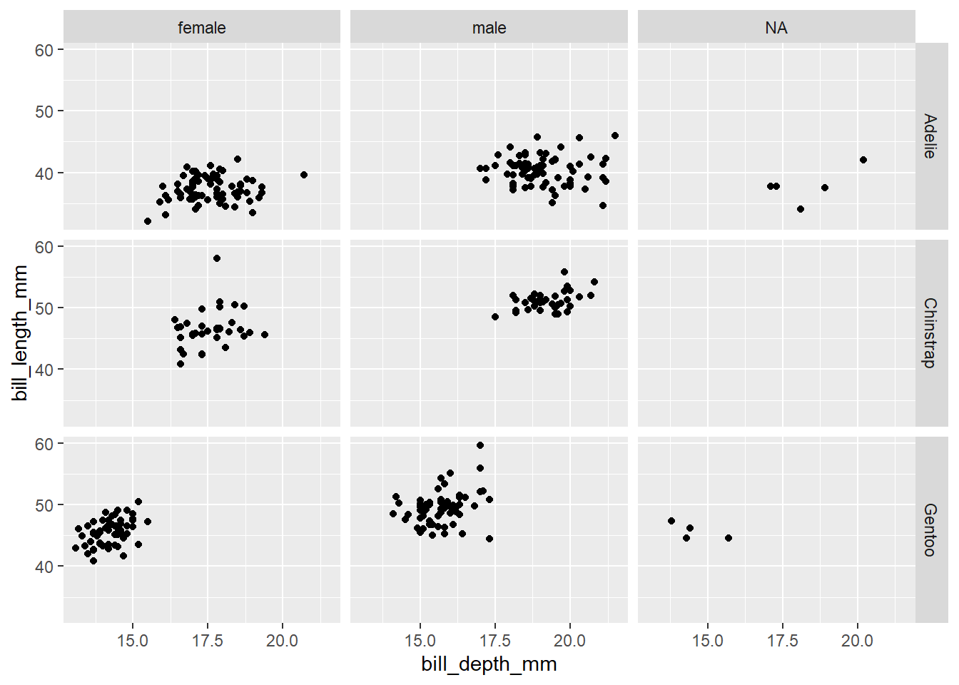
ggplot(penguins, aes(x = bill_depth_mm, y = bill_length_mm)) +
  geom_point() +
  facet_grid(sex ~ species)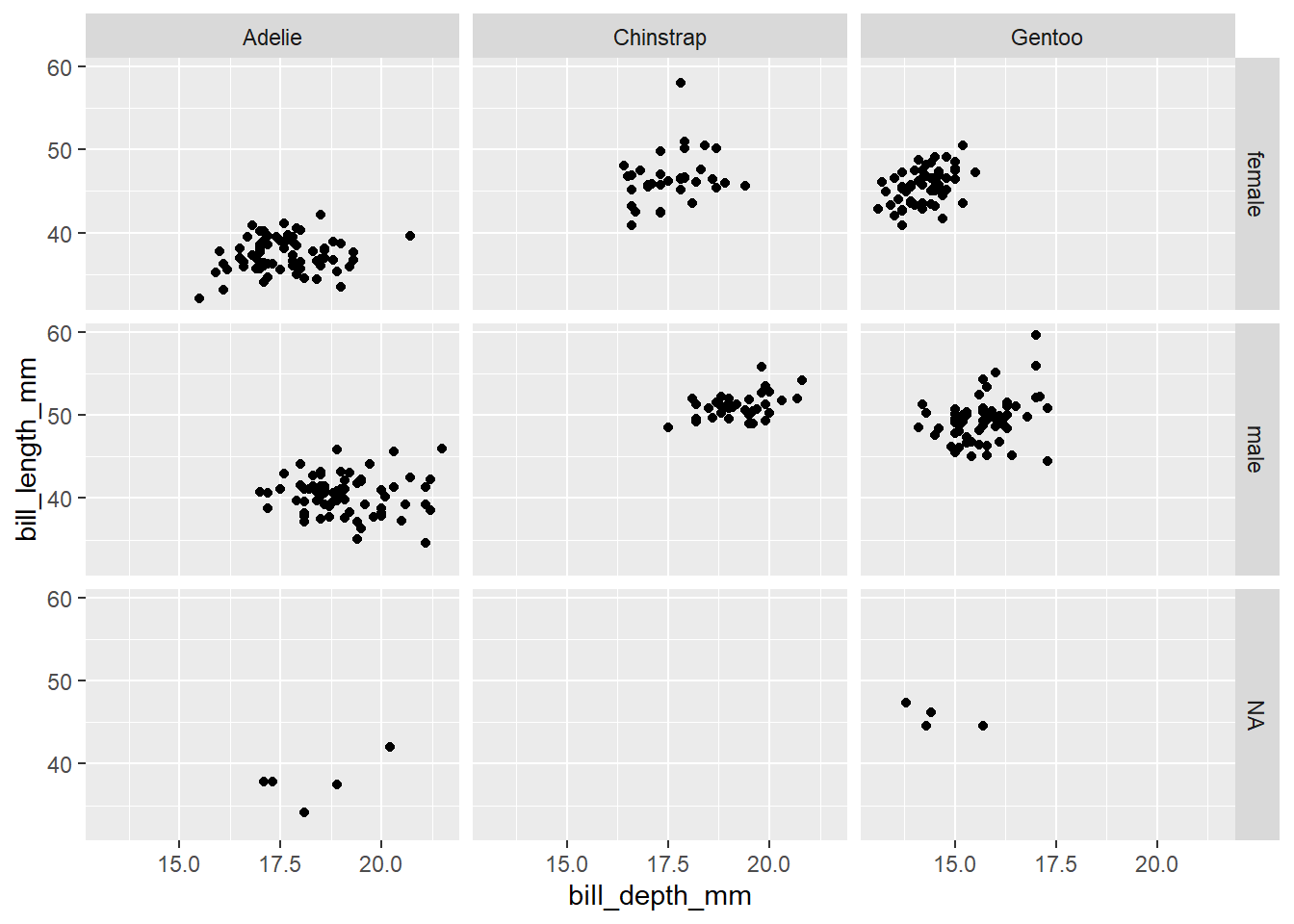
#| fig-asp: 0.5
ggplot(penguins, aes(x = bill_depth_mm, y = bill_length_mm)) +
  geom_point() +
  facet_wrap(~ species)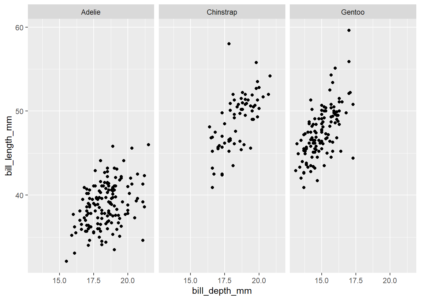
#| fig-asp: 0.5
ggplot(penguins, aes(x = bill_depth_mm, y = bill_length_mm)) +
  geom_point() +
  facet_grid(. ~ species)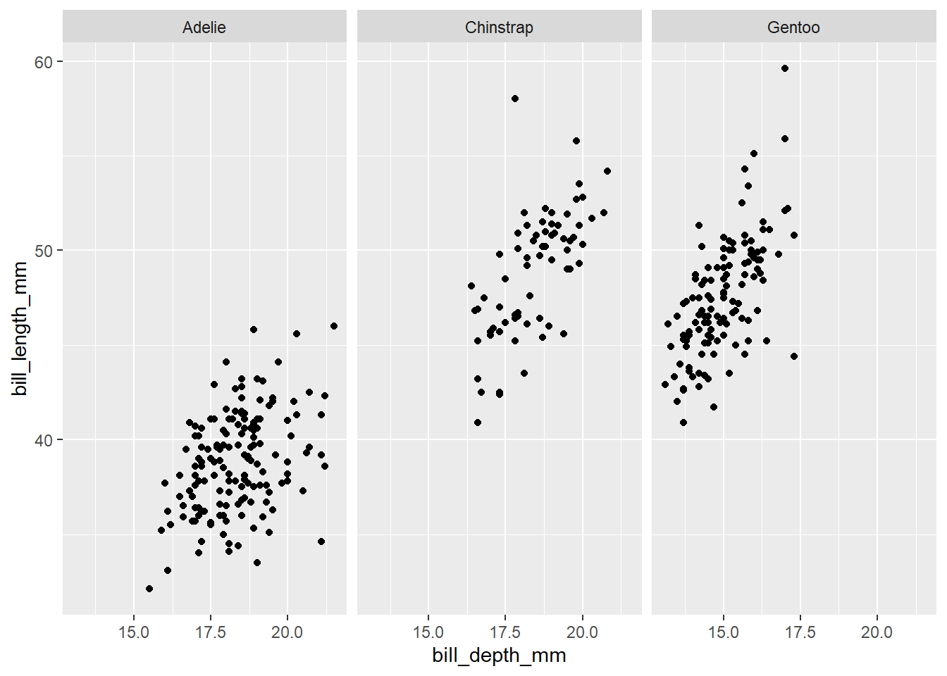
ggplot(penguins, aes(x = bill_depth_mm, y = bill_length_mm)) +
  geom_point() +
  facet_wrap(~ species, ncol = 2)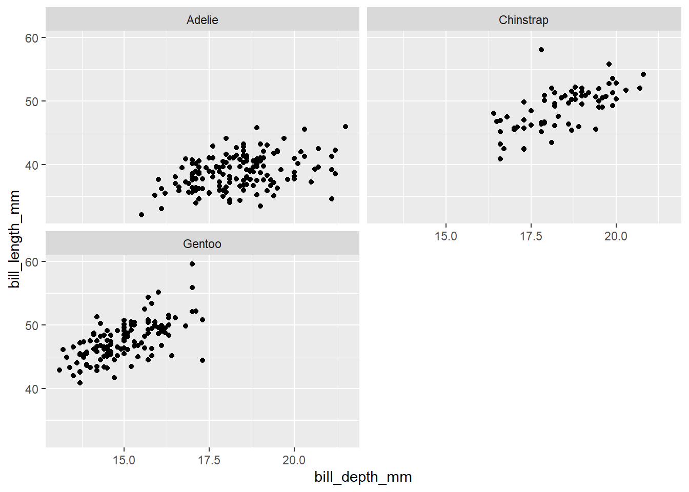
Faceting summary
facet_grid():- 2d grid
rows ~ cols- use
.for no split
facet_wrap(): 1d ribbon wrapped according to number of rows and columns specified or available plotting area
Facet and color
ggplot(
  penguins,
  aes(x = bill_depth_mm,
      y = bill_length_mm,
      color = species)) +
  geom_point() +
  facet_grid(species ~ sex) +
  scale_color_viridis_d()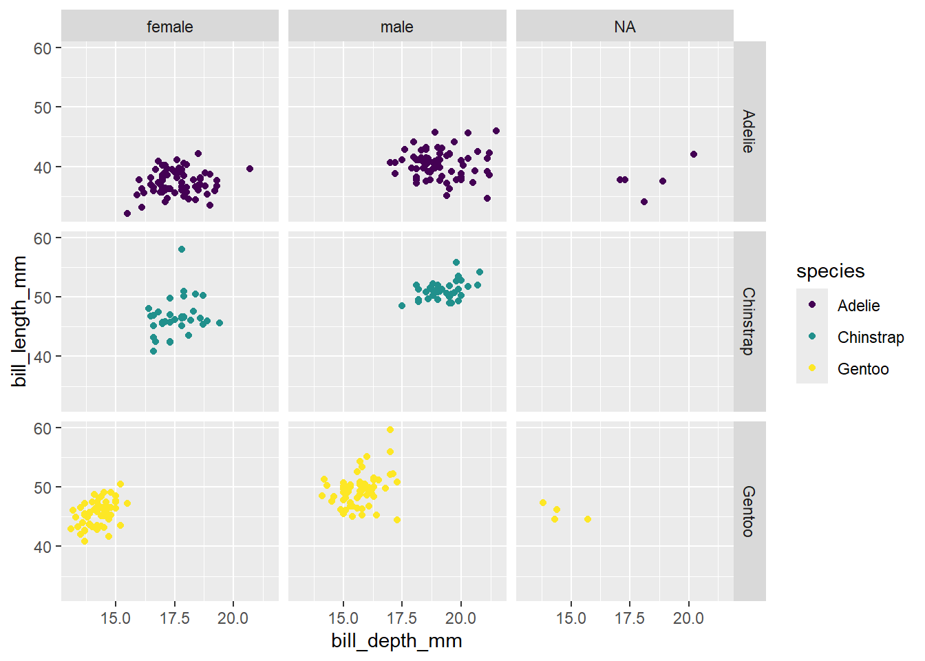
Face and color, no legend
ggplot(
  penguins,
  aes(x = bill_depth_mm,
      y = bill_length_mm,
      color = species)) +
  geom_point() +
  facet_grid(species ~ sex) +
  scale_color_viridis_d() +
  guides(color = "none")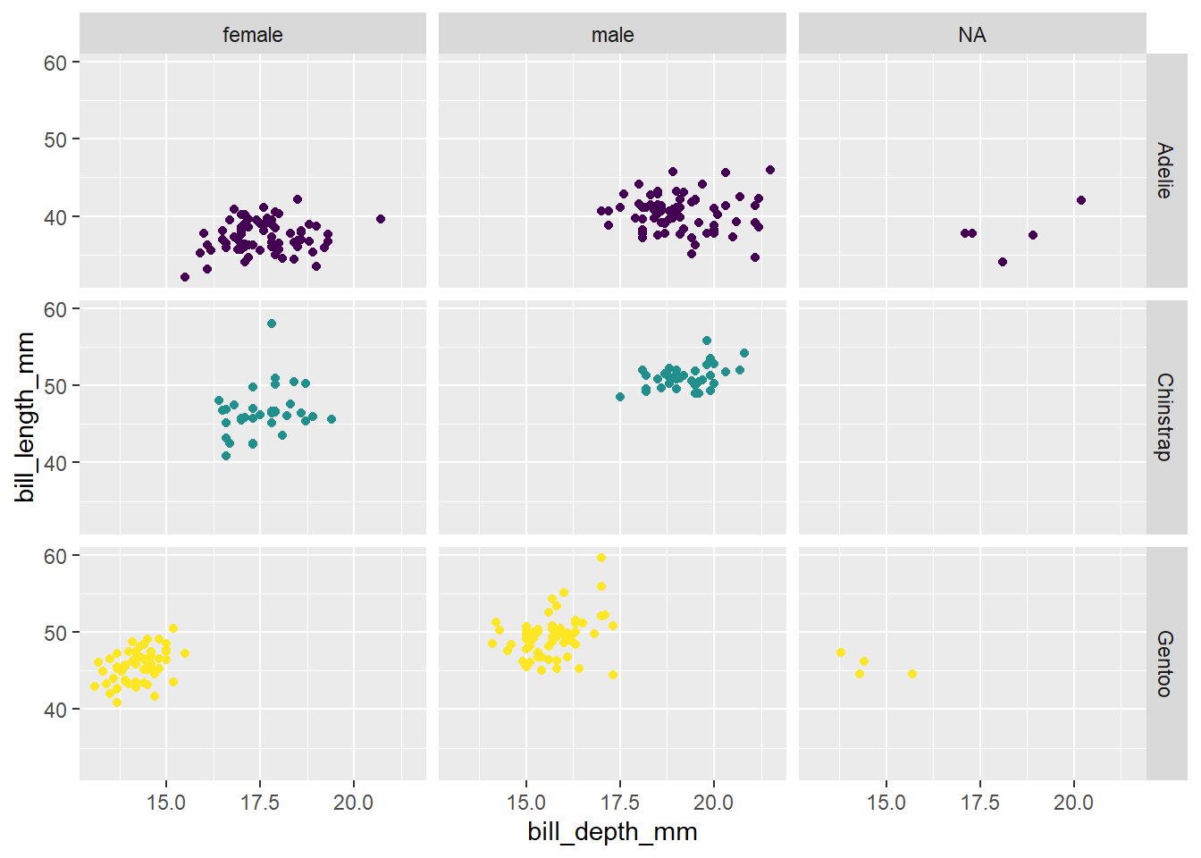
This page adapts material from Data Science in a Box (Unit 2, Deck 2: “Visualising data with ggplot2”) by Mine Çetinkaya-Rundel, licensed under CC BY-SA 4.0. Source: tidyverse/datascience-box. Modified: reorganized into a single Quarto page; no dataset/package substitutions were needed for this lesson.