library(tidyverse)
library(datasauRus)AE02 - Hello git
Using version control to track changes
The main goal of this activity is to introduce you to Git and GitHub, which is the collaboration and version control system that we will be using throughout the course.
Note
git is a version control system — like “Track Changes” on steroids — and GitHub is the home for your git-based projects on the internet. Like Google Drive or DropBox
As the semester progresses, you are encouraged to explore beyond what’s dictated here; a willingness to experiment will make you a much better programmer.
ImportantConnecting GitHub and RStudio
You should have already received an invitation to join the GitHub organization for this course. You need to accept the invitation before moving on to the next step.
Authenticating to Github
Providing your username and PAT every time you do a github action in RStudio is a pain. Best practices would be to save that PAT in your R Environment (that stays on your computer).
ImportantDidn’t create a PAT?
- In the R console type:
usethis::create_github_token(). This will open a browser tab to Github. - Name this token something clear like “cal icor for ds class”
- Leave default boxes checked
- Click copy button to copy your pat
- Set this pat in R using the command
gitcreds::gitcreds_set()
Getting your assignment files
Each of your assignments will begin with the following steps.
- Log into GitHub
- Go to the
DATA385-F26organization: https://github.com/DATA385-f26 - Find the repo we’re working on today:
ae02-YOUR NAME
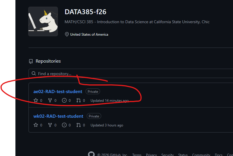
- Click the green Code button, select HTTPS, and copy the repo URL.

- Log into R Studio either directly or by going to JupyterHub and then RStudio.
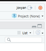
- In Rstudio click the cube icon in the top right
- Click New project –> version control –> git
- paste your URL in the repository URL
- (Optional) - change the project directory name to remove
YOUR NAMEand just keep theae02 - leave the subdirectory alone
Warm up
Before we introduce the data, let’s warm up with some simple exercises.
YAML
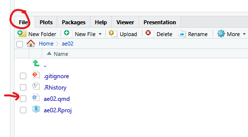
Open the Quarto (qmd) file in your project, change the author name to your name, and render the document.
Committing changes
Go to the Git pane in RStudio.
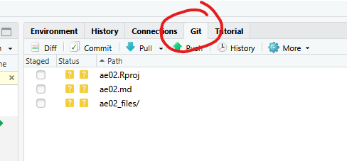
If you’ve made changes to your qmd file, you’ll see it listed here. If you rendered you’ll also see the corresponding ae02.md file that was created and the ae02_files/ folder that stores the output of various code chunks.
Click the Staged boxe to select the qmd file, then click Diff — this shows the difference between the last committed state of the document and your current changes. If you’re happy with the changes, stage all the files write “Update author name” in the Commit message box and hit Commit.
You don’t have to commit after every change — that would get cumbersome. Commit states that are meaningful to you for inspection, comparison, or restoration. Early on we’ll tell you exactly when to commit and what message to use; later in the semester you’ll make these calls yourself.
Pushing changes
Now that you’ve committed a change, it’s time to push it to your repo on GitHub, so others (your instructor) can see it. Click Push. This may prompt you for your username and token.
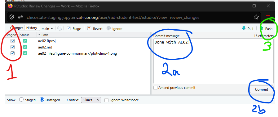
This process can be summed up by
Important
Note that the window doesn’t close after push. Nor does it tell you it’s successful. You have to check Github to see if your commit message shows.
TipUsed git before?
If you’ve used git before and you are used to working in the terminal, I’ve got good and bad news for you.
- Good: You can use many commands (add/commit/push/pull) from the command line. This is what I do, but the button-clickey methods that I show here are easy for beginners to start with
- Bad: If you use
git clonedirectly, you have to do another step to convert the folder into an official.RprojR project file. - Good: You can type
usethis::create_from_github("ORG/REPO-NAME", destdir = "~")in the R console. This clones, creates the .Rproj, and prompts to switch RStudio into the new project.
Packages
In this activity we’ll work with two packages: datasauRus, which contains the dataset we’ll be using, and tidyverse, a collection of packages for doing data analysis in a “tidy” way. Load them by running:
Note these are also loaded in your qmd document already.
Data
The data frame we’ll work with today is called datasaurus_dozen, in the datasauRus package. This single data frame actually contains 13 datasets, designed to show why data visualization is important and how summary statistics alone can be misleading. The different datasets are marked by the dataset variable.
If it’s confusing that
datasaurus_dozen contains 13 datasets, you’re not alone — think “baker’s dozen.”Exercises
Based on the help file, how many rows and columns does
datasaurus_dozenhave? What variables are included?Let’s look at what these datasets are with a frequency table of the
datasetvariable1:
datasaurus_dozen %>%
  count(dataset) %>%
  print(13)
# A tibble:
# 13 × 2
dataset
<chr>
1 away
2 bullseye
3 circle
4 dino
5 dots
6 h_lines
7 high_lines
8 slant_down
9 slant_up
10 star
11 v_lines
12 wide_lines
13 x_shape
# ℹ 1 more
# variable:
# n <int>- Plot
yvs.xfor thedinodataset. Then calculate the correlation coefficient betweenxandyfor this dataset.
Start with datasaurus_dozen and pipe it into filter() for observations where dataset == "dino". Store the result as dino_data.
dino_data <- datasaurus_dozen %>%
  filter(dataset == "dino")
The pipe operator %>% takes what comes before it and sends it as the first argument to what comes after it — so this filters datasaurus_dozen for dataset == "dino". The assignment operator <- names the result dino_data.
Next, visualize it with ggplot(). Its first argument is the data; then we define the aesthetic mappings — which columns map to which visual features, e.g. x to the x-axis and y to the y-axis. Then we add a layer defining which geometric shapes represent each observation — here, points, via geom_point().
ggplot(data = dino_data, mapping = aes(x = x, y = y)) +
  geom_point()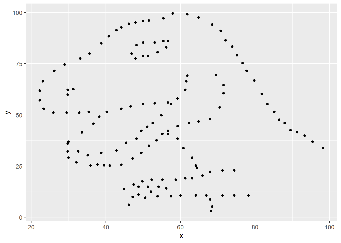
This is a lot at once — you’ll learn the layered philosophy of building visualizations in more depth soon. For now, follow along with the code provided.
For the second part, we calculate a summary statistic: the correlation coefficient (often \(r\)). It measures the linear association between two variables — some pairs we plot won’t have a linear relationship at all, which is exactly why we visualize first and only calculate \(r\) when it’s relevant. Here, x and y clearly aren’t linearly related, but for illustration, let’s calculate it anyway.
dino_data %>%
  summarize(r = cor(x, y))
# A tibble: 1 × 1
r
<dbl>
1 -0.0645
Warning
Render, commit, and push your changes to GitHub with the commit message “Added answer for Ex 2”. Make sure to commit and push all changed files so your Git pane is cleared up afterwards
- Plot
yvs.xfor thestardataset. Reuse the code above, swapping in the dataset name. Calculate the correlation coefficient for this dataset — how does it compare todino’s?
Warning
Yay, you’re done! Commit all remaining changes with the message “Done with AE02!”, and push. Make sure to commit and push all changed files so your Git pane is cleared up afterwards.
Footnotes
Matejka, Justin, and George Fitzmaurice. “Same stats, different graphs: Generating datasets with varied appearance and identical statistics through simulated annealing.” Proceedings of the 2017 CHI Conference on Human Factors in Computing Systems. ACM, 2017. The original Datasaurus (
dino) was created by Alberto Cairo; the other twelve were generated via simulated annealing to share the same summary statistics as the Datasaurus but look very different when plotted.↩︎