Exploratory Data Analysis

wk4-d01-eda

Dr. D

Chico State
DATA 385 - Fall 2026

September 15, 2026

Setup

library(tidyverse) # contains ggplot2 and dplyr
library(nycflights13)

Data: diamonds & flights

diamonds — built into ggplot2

~54,000 round-cut diamonds: price, carat, cut, color, clarity, and physical dimensions x/y/z

glimpse(diamonds)
Rows: 53,940
Columns: 10
$ carat   <dbl> 0.23, 0.21, 0.23, 0.29, 0.31, 0.24, 0.24, 0.26, 0.22…
$ cut     <ord> Ideal, Premium, Good, Premium, Good, Very Good, Very…
$ color   <ord> E, E, E, I, J, J, I, H, E, H, J, J, F, J, E, E, I, J…
$ clarity <ord> SI2, SI1, VS1, VS2, SI2, VVS2, VVS1, SI1, VS2, VS1, …
$ depth   <dbl> 61.5, 59.8, 56.9, 62.4, 63.3, 62.8, 62.3, 61.9, 65.1…
$ table   <dbl> 55, 61, 65, 58, 58, 57, 57, 55, 61, 61, 55, 56, 61, …
$ price   <int> 326, 326, 327, 334, 335, 336, 336, 337, 337, 338, 33…
$ x       <dbl> 3.95, 3.89, 4.05, 4.20, 4.34, 3.94, 3.95, 4.07, 3.87…
$ y       <dbl> 3.98, 3.84, 4.07, 4.23, 4.35, 3.96, 3.98, 4.11, 3.78…
$ z       <dbl> 2.43, 2.31, 2.31, 2.63, 2.75, 2.48, 2.47, 2.53, 2.49…

flights — from nycflights13

~336,000 flights departing NYC airports in 2013: scheduled/actual times, delays, carrier, destination

glimpse(flights)
Rows: 336,776
Columns: 19
$ year           <int> 2013, 2013, 2013, 2013, 2013, 2013, 2013, 201…
$ month          <int> 1, 1, 1, 1, 1, 1, 1, 1, 1, 1, 1, 1, 1, 1, 1, …
$ day            <int> 1, 1, 1, 1, 1, 1, 1, 1, 1, 1, 1, 1, 1, 1, 1, …
$ dep_time       <int> 517, 533, 542, 544, 554, 554, 555, 557, 557, …
$ sched_dep_time <int> 515, 529, 540, 545, 600, 558, 600, 600, 600, …
$ dep_delay      <dbl> 2, 4, 2, -1, -6, -4, -5, -3, -3, -2, -2, -2, …
$ arr_time       <int> 830, 850, 923, 1004, 812, 740, 913, 709, 838,…
$ sched_arr_time <int> 819, 830, 850, 1022, 837, 728, 854, 723, 846,…
$ arr_delay      <dbl> 11, 20, 33, -18, -25, 12, 19, -14, -8, 8, -2,…
$ carrier        <chr> "UA", "UA", "AA", "B6", "DL", "UA", "B6", "EV…
$ flight         <int> 1545, 1714, 1141, 725, 461, 1696, 507, 5708, …
$ tailnum        <chr> "N14228", "N24211", "N619AA", "N804JB", "N668…
$ origin         <chr> "EWR", "LGA", "JFK", "JFK", "LGA", "EWR", "EW…
$ dest           <chr> "IAH", "IAH", "MIA", "BQN", "ATL", "ORD", "FL…
$ air_time       <dbl> 227, 227, 160, 183, 116, 150, 158, 53, 140, 1…
$ distance       <dbl> 1400, 1416, 1089, 1576, 762, 719, 1065, 229, …
$ hour           <dbl> 5, 5, 5, 5, 6, 5, 6, 6, 6, 6, 6, 6, 6, 6, 6, …
$ minute         <dbl> 15, 29, 40, 45, 0, 58, 0, 0, 0, 0, 0, 0, 0, 0…
$ time_hour      <dttm> 2013-01-01 05:00:00, 2013-01-01 05:00:00, 20…

What is exploratory data analysis?

EDA is an iterative cycle

  • Generate questions about your data
  • Search for answers by visualizing, transforming, and modeling
  • Use what you learn to refine your questions, or ask new ones

Note

EDA is a state of mind, not a checklist. Early on, ask any question that comes to mind — there are no bad questions, only ones that turn out not to be useful.

Two questions worth asking of every variable

  1. What variation occurs within each variable?
  2. What covariation occurs between variables?

We’ll use these two questions to organize the rest of the deck.

Variation

Visualizing a distribution

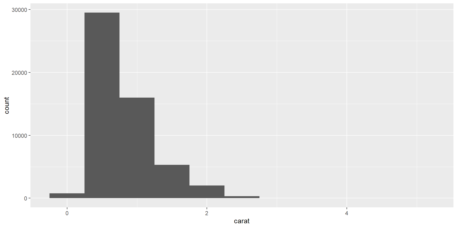
ggplot(diamonds, aes(x = carat)) +
  geom_histogram(binwidth = 0.5)

What did we learn here?

Typical values

Zoom in on carats under 3, with a narrower binwidth:
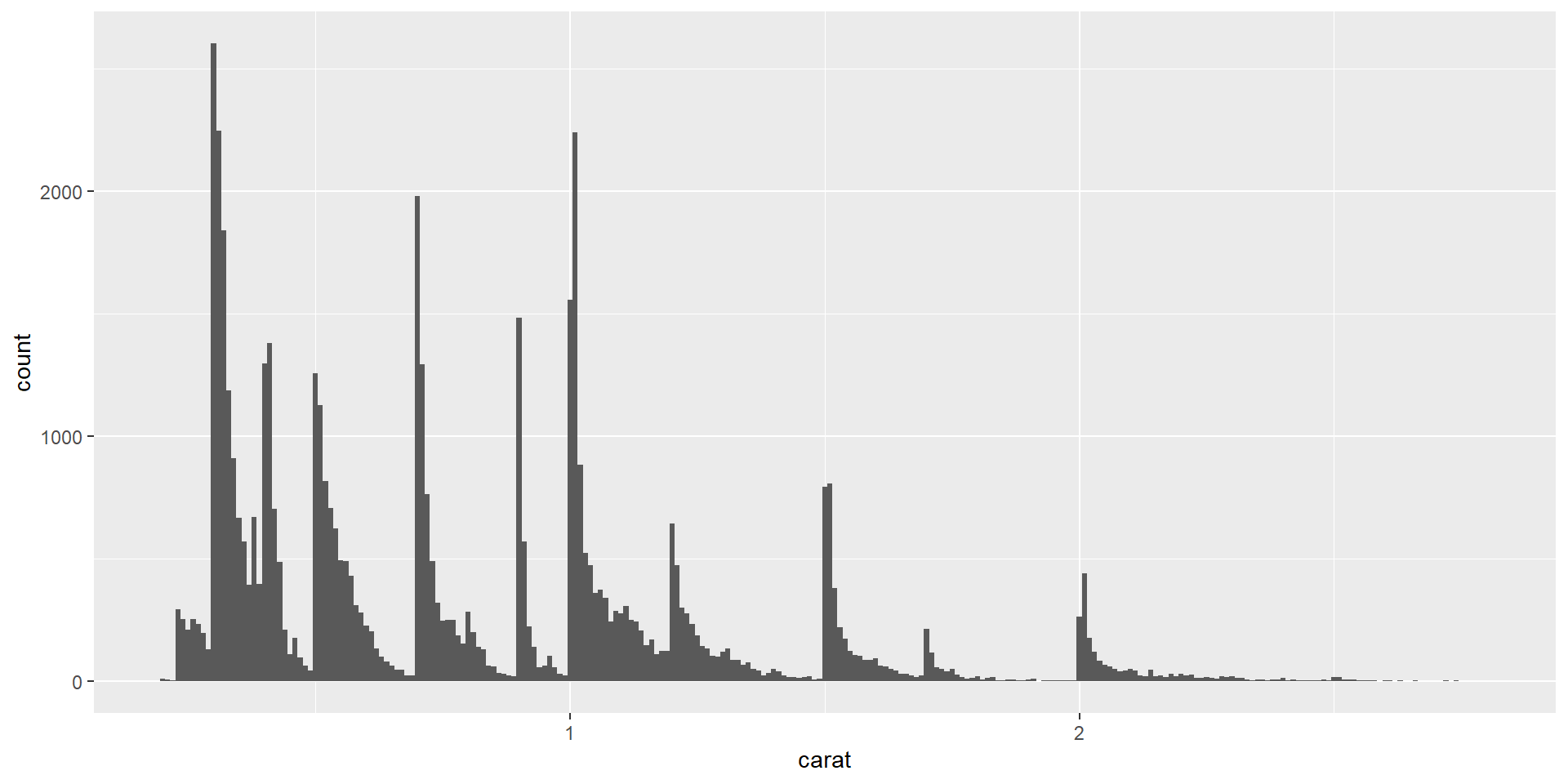
smaller <- diamonds |> filter(carat < 3)

ggplot(smaller, aes(x = carat)) +
  geom_histogram(binwidth = 0.01)

Why the peaks at whole and half carats?

You try it: variation

Your turn

Explore the distribution of price. Do you discover anything unusual or surprising? (Hint: Carefully think about the binwidth and make sure you try a wide range of values.)

Add and commit with “YTI 1 variation done”.

Unusual values

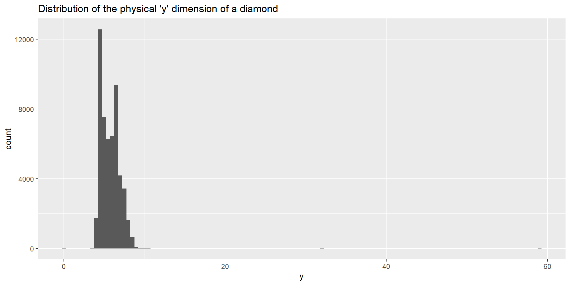
ggplot(diamonds, aes(x = y)) + geom_histogram(binwidth = 0.5) + 
  ggtitle("Distribution of the physical 'y' dimension of a diamond")

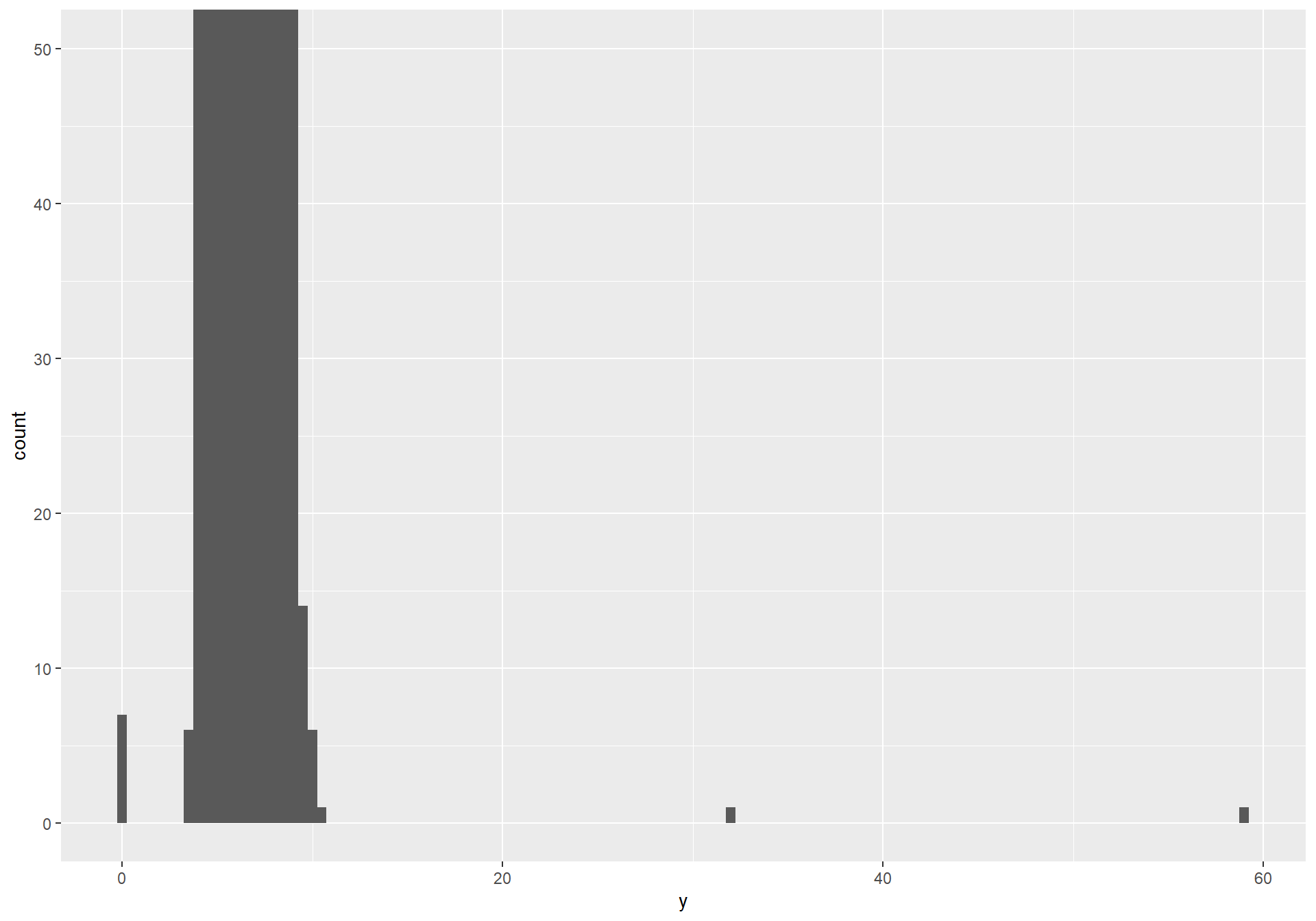
The axis range makes it hard to see anything besides a few unusual bars.

Zoom in with coord_cartesian()

ggplot(diamonds, aes(x = y)) +
  geom_histogram(binwidth = 0.5) +
  coord_cartesian(ylim = c(0, 50))

Zoom!

coord_cartesian() zooms the view without discarding data — unlike xlim()/ylim(), which drop out-of-range values before the bars are even computed.

Pull out the unusual values

y is a physical dimension in mm — a value of 0 is impossible, and ~59mm is absurd for a diamond costing a few thousand dollars. These are data entry errors worth flagging for further exploration. Not ignoring.

unusual <- diamonds |>
  filter(y < 3 | y > 20) |>
  select(price, x, y, z) |>
  arrange(y)
unusual
# A tibble: 9 × 4
  price     x     y     z
  <int> <dbl> <dbl> <dbl>
1  5139  0      0    0   
2  6381  0      0    0   
3 12800  0      0    0   
4 15686  0      0    0   
5 18034  0      0    0   
6  2130  0      0    0   
7  2130  0      0    0   
8  2075  5.15  31.8  5.12
9 12210  8.09  58.9  8.06

Dealing with unusual values

Two options

Drop the whole row — not recommended, since you lose every other, valid, measurement in that row

diamonds2 <- diamonds |>
  filter(between(y, 3, 20))


Replace the unusual value with NA, and let the rest of the row survive

diamonds2 <- diamonds |>
  mutate(y = if_else(y < 3 | y > 20, NA, y))

Plotting with missing values

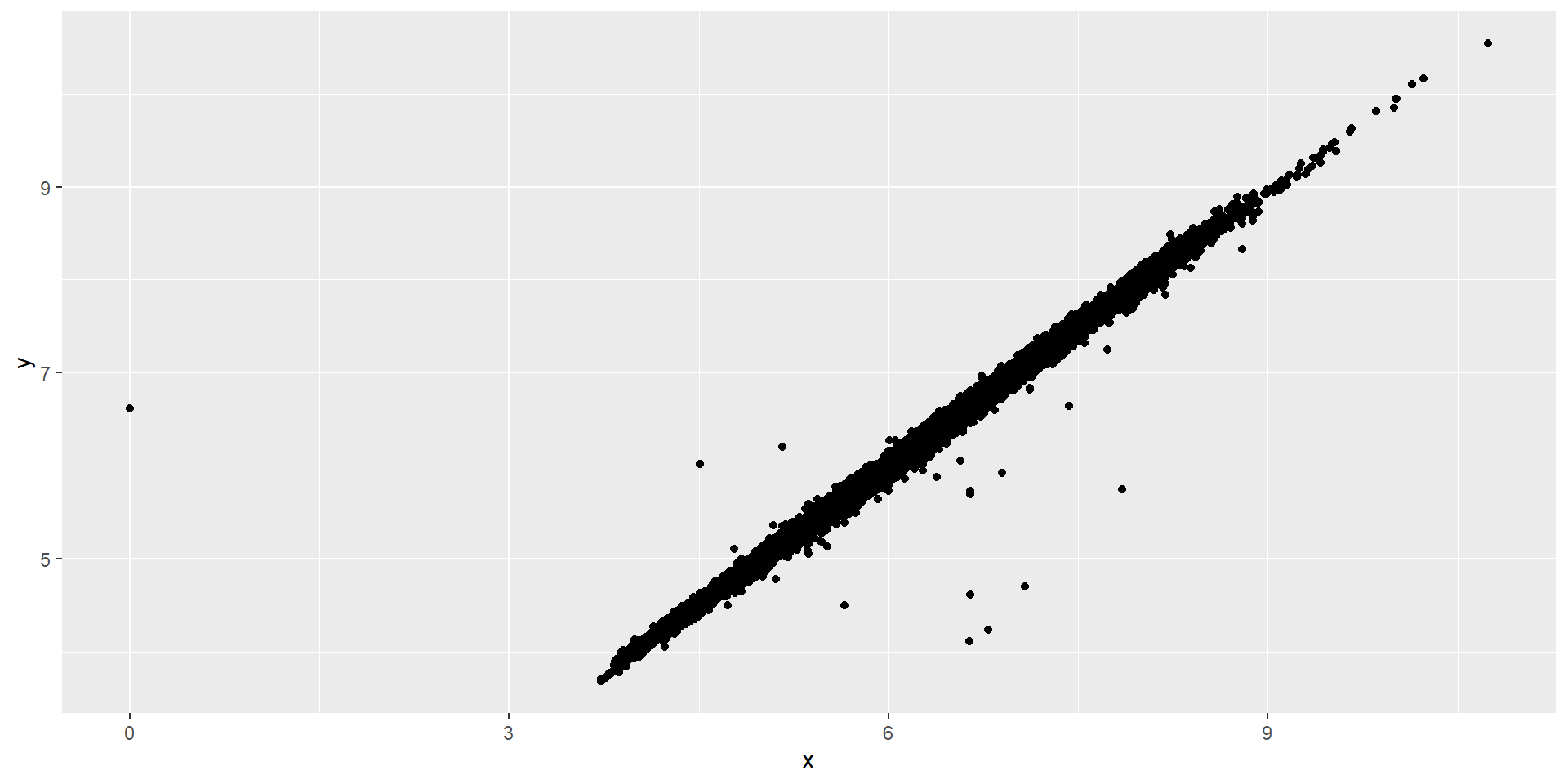
ggplot(diamonds2, aes(x = x, y = y)) +
  geom_point()

ggplot2 warns about the rows it had to drop. To suppress that warning, add na.rm = TRUE in the geom_point() layer.

Why a value is missing can matter

flights |> # start with flights
  mutate( # make new variables
    cancelled = is.na(dep_time),  # is dep_time missing?
    sched_hour = sched_dep_time %/% 100, # divide time by 100 and drop remainder
    sched_min = sched_dep_time %% 100, # divide and keep only the remainder
    sched_dep_time = sched_hour + sched_min / 60 # convert to 24hr time
  ) |>
  ggplot(aes(x = sched_dep_time)) +
  geom_freqpoly(aes(color = cancelled), binwidth = 1/4)
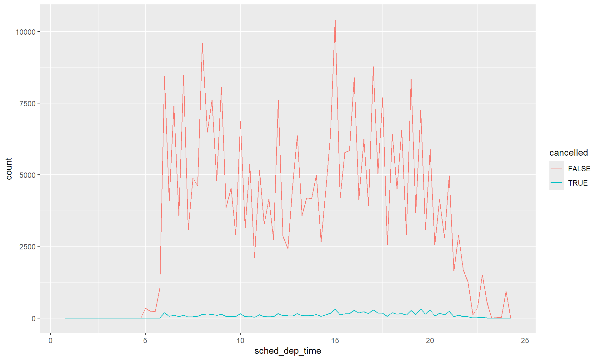
Cancelled flights are scheduled slightly later in the day on average.

Comparing a variable’s distribution conditional on missingness of another variable is useful information.

You try it: missing values

Your turn

What does na.rm = TRUE argument do in mean() and sum()? That is, what’s the difference between mean(y, na.rm=TRUE) and mean(y)? Run these codes to find out then answer in a sentence.

Add and commit with “YTI 1 missing values done”.

Covariation

A categorical and a numerical variable
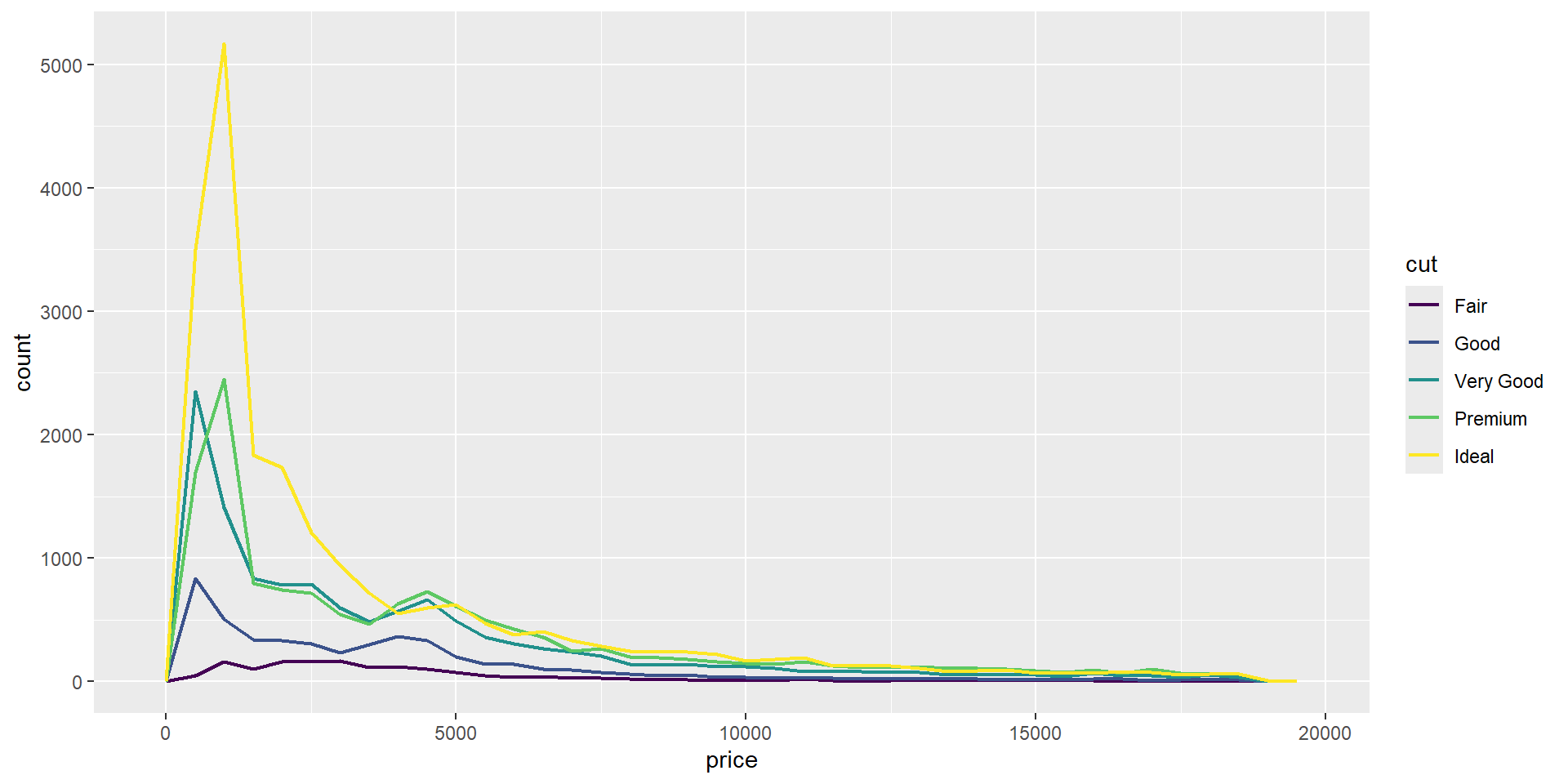
ggplot(diamonds, aes(x = price, color = cut)) +
  geom_freqpoly(binwidth = 500, linewidth = 0.75)

Hard to compare shapes when the counts differ so much by cut.

Compare density instead of count
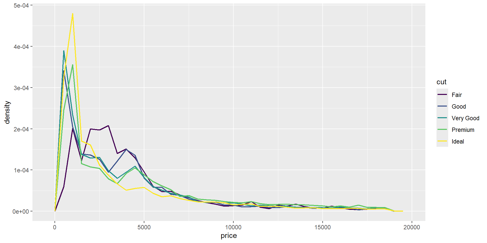
ggplot(diamonds, aes(x = price, y = after_stat(density), color = cut)) +
  geom_freqpoly(binwidth = 500, linewidth = 0.75)

Surprise: Fair diamonds have the highest average price.

Boxplots make the comparison easier
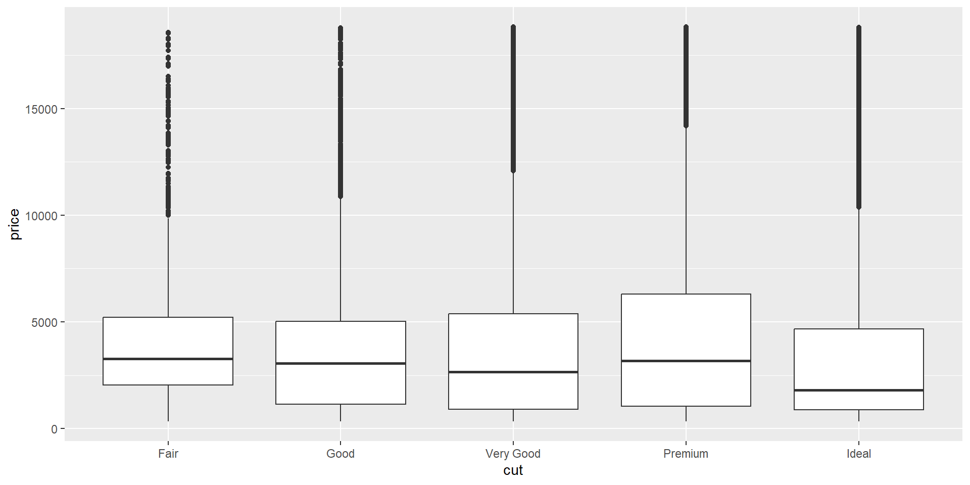
ggplot(diamonds, aes(x = cut, y = price)) +
  geom_boxplot()

Is the ordering of the categories along the x axis meaningful?

Nominal boxplots

Consider the highway MPG for a variety of different vehicle class:
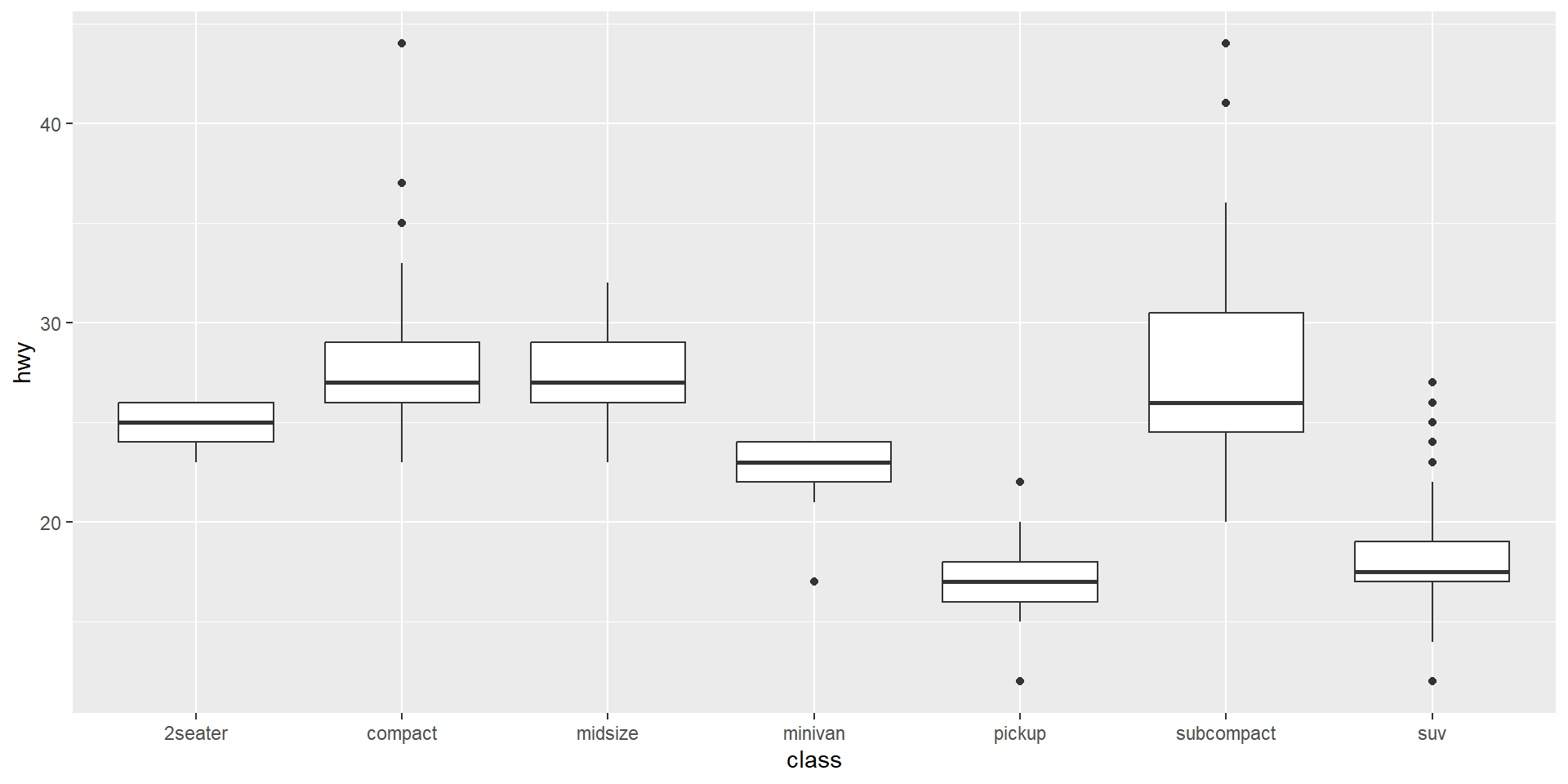
ggplot(mpg, aes(x = class, y = hwy)) +
  geom_boxplot()

Alphabetical order isn’t a very useful order here — nothing about the vehicle class names tells you anything about hwy. But hwy is nominal…

Reordering by a summary statistic
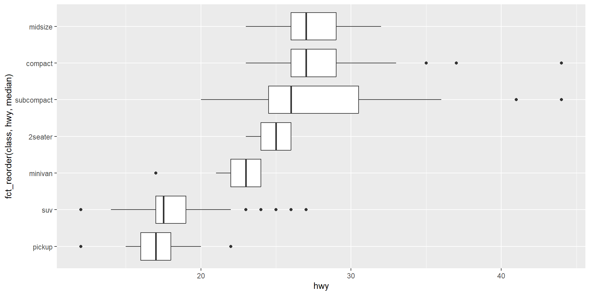
ggplot(mpg, aes(x = fct_reorder(class, hwy, median), y = hwy)) +
  geom_boxplot() +
  coord_flip() # What do you think this did?

fct_reorder() reorders class’s factor levels by the median of hwy within each level, so the boxplots read in order — much easier to scan than alphabetical.

You try it: coord_flip

Your turn

Instead of using coord_flip() as a new layer, try exchanging the x and y variables of that last plot. How do they compare?

Add and commit with “YTI 1 coord_flip done”.

More alternative visualizations for two categorical variables

When there are a lot of levels to each category, side by side or stacked boxplots can be difficult to read. So here are some alternatives:
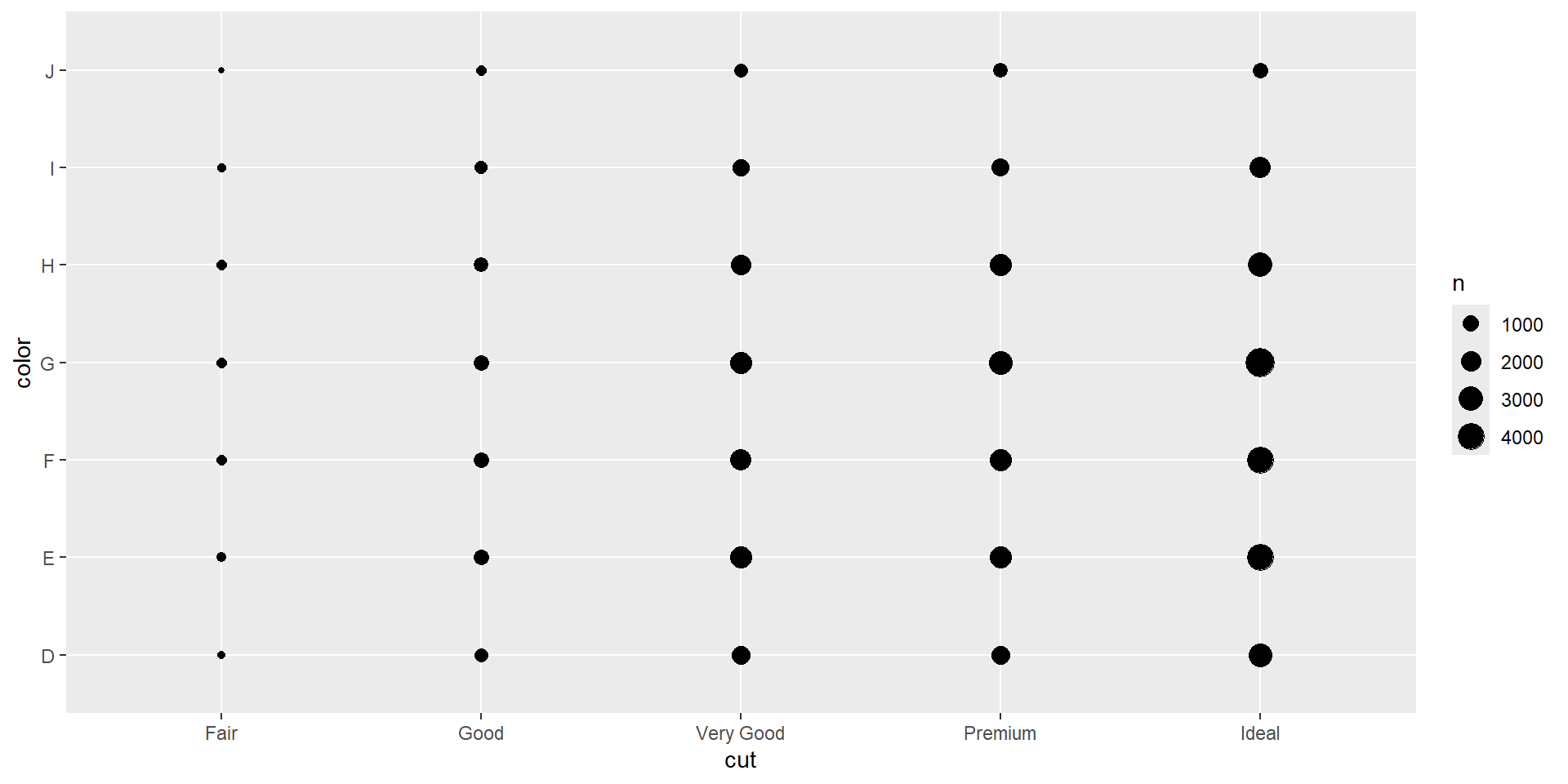
ggplot(diamonds, 
       aes(x = cut, y = color)) +
  geom_count()

Auto-scale the size of the dots by the frequency

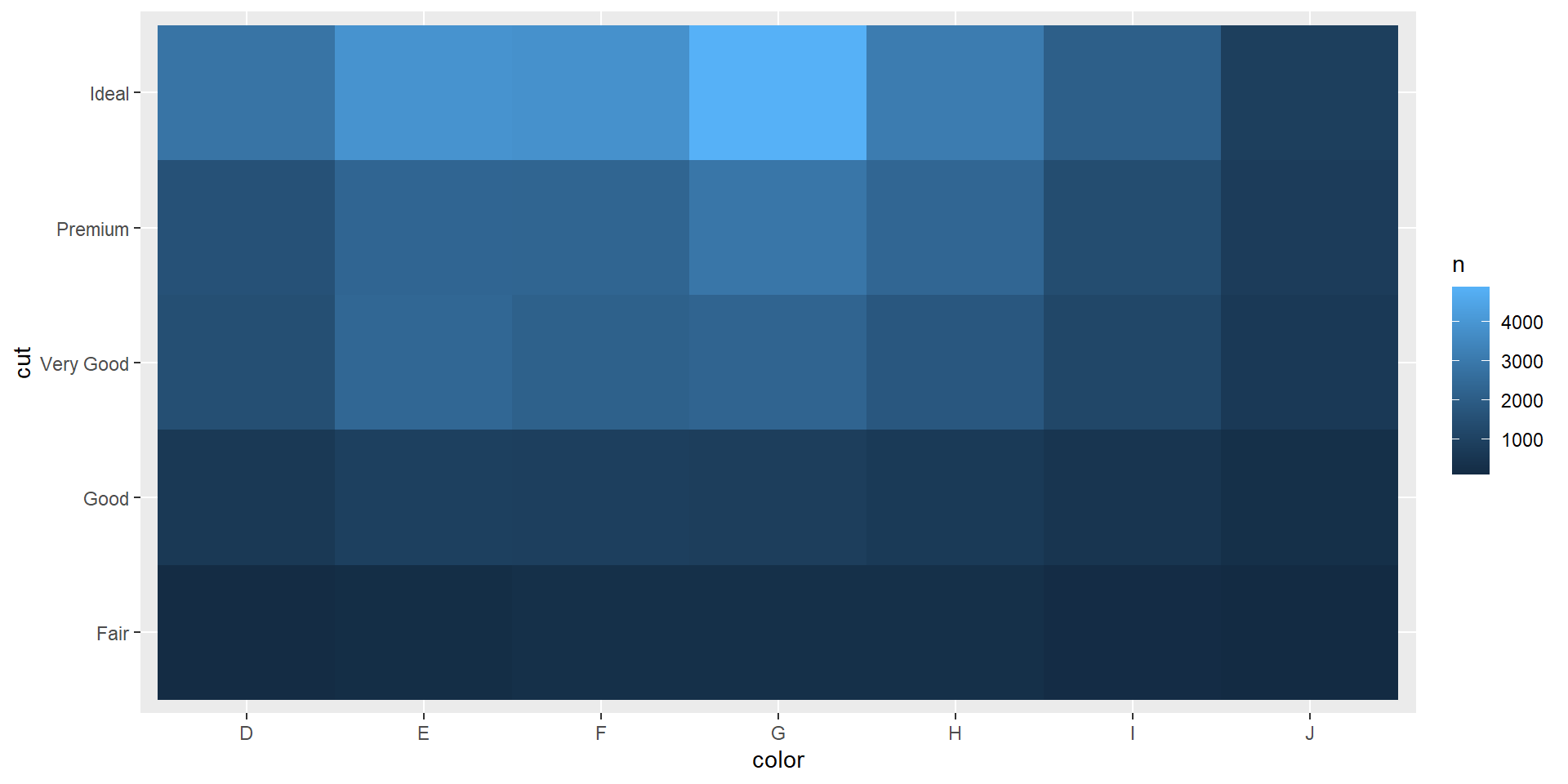
diamonds |>
  count(color, cut) |>
  ggplot(aes(x = color, y = cut)) +
  geom_tile(aes(fill = n))

Make a grid of tiles and fill the tile according to n

Patterns and models

Patterns reveal relationships

  • A pattern in your data is a clue about a relationship
  • If two variables covary, you can use one to help predict the other
  • Models are tools for extracting patterns out of data, so you can ask what’s left over once the obvious pattern is accounted for

Recap

  • Variation: how a single variable’s values differ — histograms, look for typical values and outliers
  • Covariation: how two variables move together — pick a plot to match the pair of variable types involved
  • EDA requires both data wrangling and data visualization
  • Missing values can be informative

Now go start Homework 02

Acknowledgements & Credits

Note

This lesson is based on R for Data Science (2e), Chapter 10: “Exploratory Data Analysis,” by Hadley Wickham, Mine Çetinkaya-Rundel, and Garrett Grolemund. The “Your turn” prompts throughout are drawn directly from the chapter’s own end-of-section exercises.