Data and visualisation

wk2-d01-data-viz

Dr. D

Chico State
DATA 385 - Fall 2026

September 1, 2026

What is in a dataset?

Setup

🎥 Data & viz - code along in wk2-d01

Dataset terminology

Each row is an observation, each column is a variable

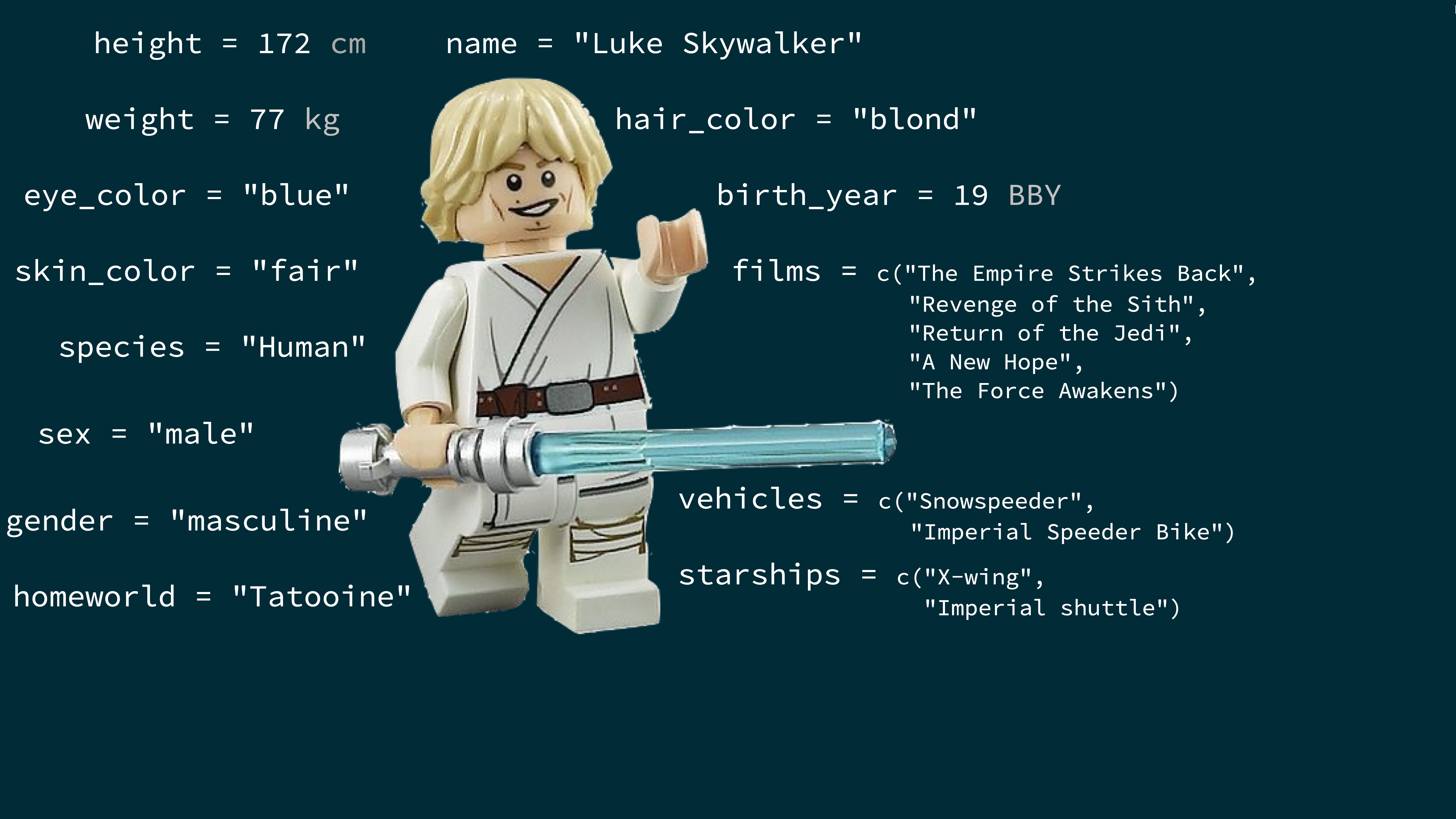
starwars
# A tibble: 87 × 14
   name  height  mass hair_color skin_color eye_color birth_year sex  
   <chr>  <int> <dbl> <chr>      <chr>      <chr>          <dbl> <chr>
 1 Luke…    172    77 blond      fair       blue            19   male 
 2 C-3PO    167    75 <NA>       gold       yellow         112   none 
 3 R2-D2     96    32 <NA>       white, bl… red             33   none 
 4 Dart…    202   136 none       white      yellow          41.9 male 
 5 Leia…    150    49 brown      light      brown           19   fema…
 6 Owen…    178   120 brown, gr… light      blue            52   male 
 7 Beru…    165    75 brown      light      blue            47   fema…
 8 R5-D4     97    32 <NA>       white, red red             NA   none 
 9 Bigg…    183    84 black      light      brown           24   male 
10 Obi-…    182    77 auburn, w… fair       blue-gray       57   male 
# ℹ 77 more rows
# ℹ 6 more variables: gender <chr>, homeworld <chr>, species <chr>,
#   films <list>, vehicles <list>, starships <list>

Luke Skywalker

(view data)

What’s in the Star Wars data?

Take a glimpse at the data:

glimpse(starwars)
Rows: 87
Columns: 14
$ name       <chr> "Luke Skywalker", "C-3PO", "R2-D2", "Darth Vader"…
$ height     <int> 172, 167, 96, 202, 150, 178, 165, 97, 183, 182, 1…
$ mass       <dbl> 77.0, 75.0, 32.0, 136.0, 49.0, 120.0, 75.0, 32.0,…
$ hair_color <chr> "blond", NA, NA, "none", "brown", "brown, grey", …
$ skin_color <chr> "fair", "gold", "white, blue", "white", "light", …
$ eye_color  <chr> "blue", "yellow", "red", "yellow", "brown", "blue…
$ birth_year <dbl> 19.0, 112.0, 33.0, 41.9, 19.0, 52.0, 47.0, NA, 24…
$ sex        <chr> "male", "none", "none", "male", "female", "male",…
$ gender     <chr> "masculine", "masculine", "masculine", "masculine…
$ homeworld  <chr> "Tatooine", "Tatooine", "Naboo", "Tatooine", "Ald…
$ species    <chr> "Human", "Droid", "Droid", "Human", "Human", "Hum…
$ films      <list> <"A New Hope", "The Empire Strikes Back", "Retur…
$ vehicles   <list> <"Snowspeeder", "Imperial Speeder Bike">, <>, <>…
$ starships  <list> <"X-wing", "Imperial shuttle">, <>, <>, "TIE Adv…

How many rows and columns does this dataset have? What does each row represent? What does each column represent?

Learn more

?starwars

How many rows and columns does this dataset have?

nrow(starwars) # number of rows
[1] 87
ncol(starwars) # number of columns
[1] 14
dim(starwars)  # dimensions (row column)
[1] 87 14

Exploratory data analysis

What is EDA?

  • Exploratory data analysis (EDA) is an approach to analysing data sets to summarize its main characteristics
  • Often, this is visual – this is what we’ll focus on first
  • But we might also calculate summary statistics and perform data wrangling/manipulation/transformation at (or before) this stage of the analysis – this is what we’ll focus on next

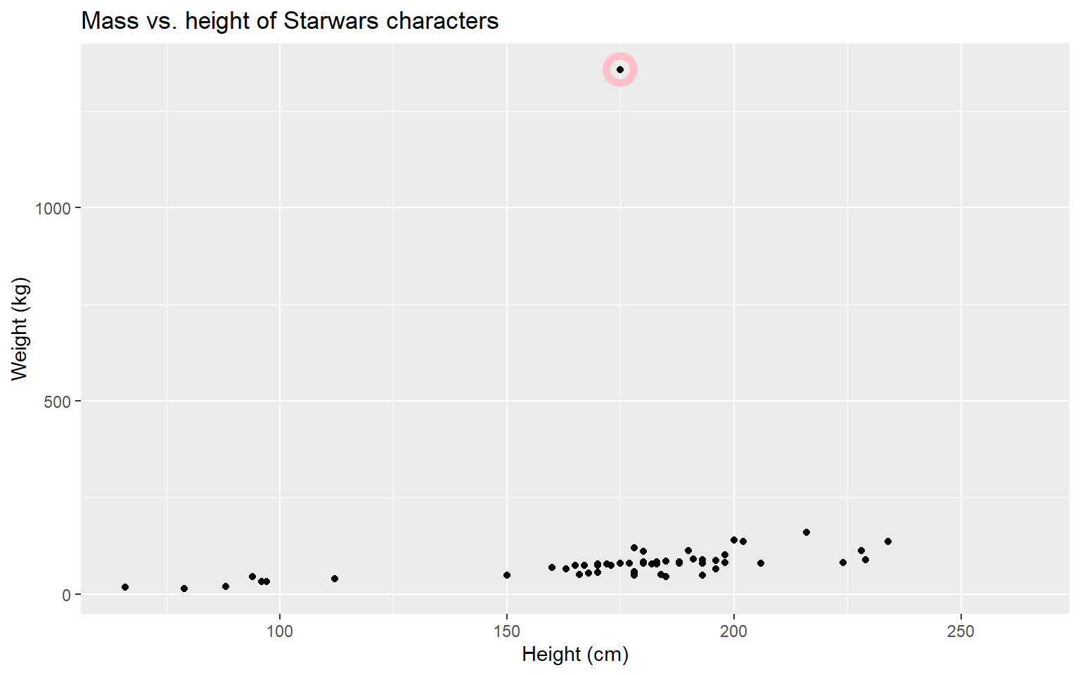
Mass vs. height

Discussion. How would you describe the relationship between mass and height of Starwars characters?

Mass vs. height

ggplot(data = starwars, mapping = aes(x = height, y = mass)) +
  geom_point() +
  labs(title = "Mass vs. height of Starwars characters",
       x = "Height (cm)", y = "Weight (kg)") +
  geom_point(data = starwars %>% 
               filter(name == "Jabba Desilijic Tiure"), 
             size = 5, pch = 1, color = "pink", stroke = 3)

Discussion. What other variables would help us understand data points that don’t follow the overall trend?

Who is the not so tall but really chubby character?

Discussion. How could we find this out?

starwars |>
  filter(mass>1000) |>
  select(name)
# A tibble: 1 × 1
  name                 
  <chr>                
1 Jabba Desilijic Tiure

Data visualization

“The simple graph has brought more information to the data analyst’s mind than any other device.” — John Tukey

  • Data visualization is the creation and study of the visual representation of data
  • Many tools for visualizing data – R is one of them
  • Many approaches/systems within R for making data visualizations – ggplot2 is one of them, and that’s what we’re going to use

ggplot2 is part of the tidyverse

  • ggplot2 is tidyverse’s data visualization package
  • gg in “ggplot2” stands for Grammar of Graphics
  • Inspired by the book Grammar of Graphics by Leland Wilkinson

Grammar of Graphics

A grammar of graphics is a tool that enables us to concisely describe the components of a graphic
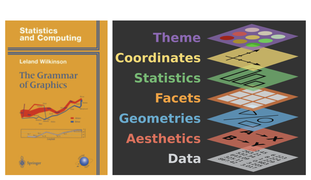
Source: BloggoType

Mass vs. height

Let’s dive into that scatterplot code and ask:

  • What are the functions doing the plotting?
  • What is the dataset being plotted?
  • Which variables map to which features (aesthetics) of the plot?
  • What does the warning mean?

Hello ggplot2!

  • ggplot() is the main function in ggplot2
  • Plots are constructed in layers
  • Structure of the code for plots can be summarized as
ggplot(data = [dataset],
       mapping = aes(x = [x-variable], y = [y-variable])) +
   geom_xxx() +
   other options

Load packages

The ggplot2 package comes with the tidyverse.

library(tidyverse)

Why do we visualize?

The Datasaurus dozen

We saw this in AE02

library(datasauRus)
glimpse(datasaurus_dozen)
Rows: 1,846
Columns: 3
$ dataset <chr> "dino", "dino", "dino", "dino", "dino", "dino", "din…
$ x       <dbl> 55.3846, 51.5385, 46.1538, 42.8205, 40.7692, 38.7179…
$ y       <dbl> 97.1795, 96.0256, 94.4872, 91.4103, 88.3333, 84.8718…

explain that we have a dataset, x and y values

Summarising the Datasaurus dozen

ignore the code for a moment, but show that for each data set the summary stats are the same. verbalize each one. reiterate that they are the same

datasaurus_dozen %>%
  group_by(dataset) %>%
  summarise(
    mean_x = mean(x),
    mean_y = mean(y),
    sd_x = sd(x),
    sd_y = sd(y),
    r = cor(x, y)
  )
# A tibble: 13 × 6
   dataset    mean_x mean_y  sd_x  sd_y       r
   <chr>       <dbl>  <dbl> <dbl> <dbl>   <dbl>
 1 away         54.3   47.8  16.8  26.9 -0.0641
 2 bullseye     54.3   47.8  16.8  26.9 -0.0686
 3 circle       54.3   47.8  16.8  26.9 -0.0683
 4 dino         54.3   47.8  16.8  26.9 -0.0645
 5 dots         54.3   47.8  16.8  26.9 -0.0603
 6 h_lines      54.3   47.8  16.8  26.9 -0.0617
 7 high_lines   54.3   47.8  16.8  26.9 -0.0685
 8 slant_down   54.3   47.8  16.8  26.9 -0.0690
 9 slant_up     54.3   47.8  16.8  26.9 -0.0686
10 star         54.3   47.8  16.8  26.9 -0.0630
11 v_lines      54.3   47.8  16.8  26.9 -0.0694
12 wide_lines   54.3   47.8  16.8  26.9 -0.0666
13 x_shape      54.3   47.8  16.8  26.9 -0.0656

talk through the code high level, but we’ll look more at this later.

Visualizing the Datasaurus dozen

This data was put together to demonstrate that if you just look at numbers you are missing very key features.
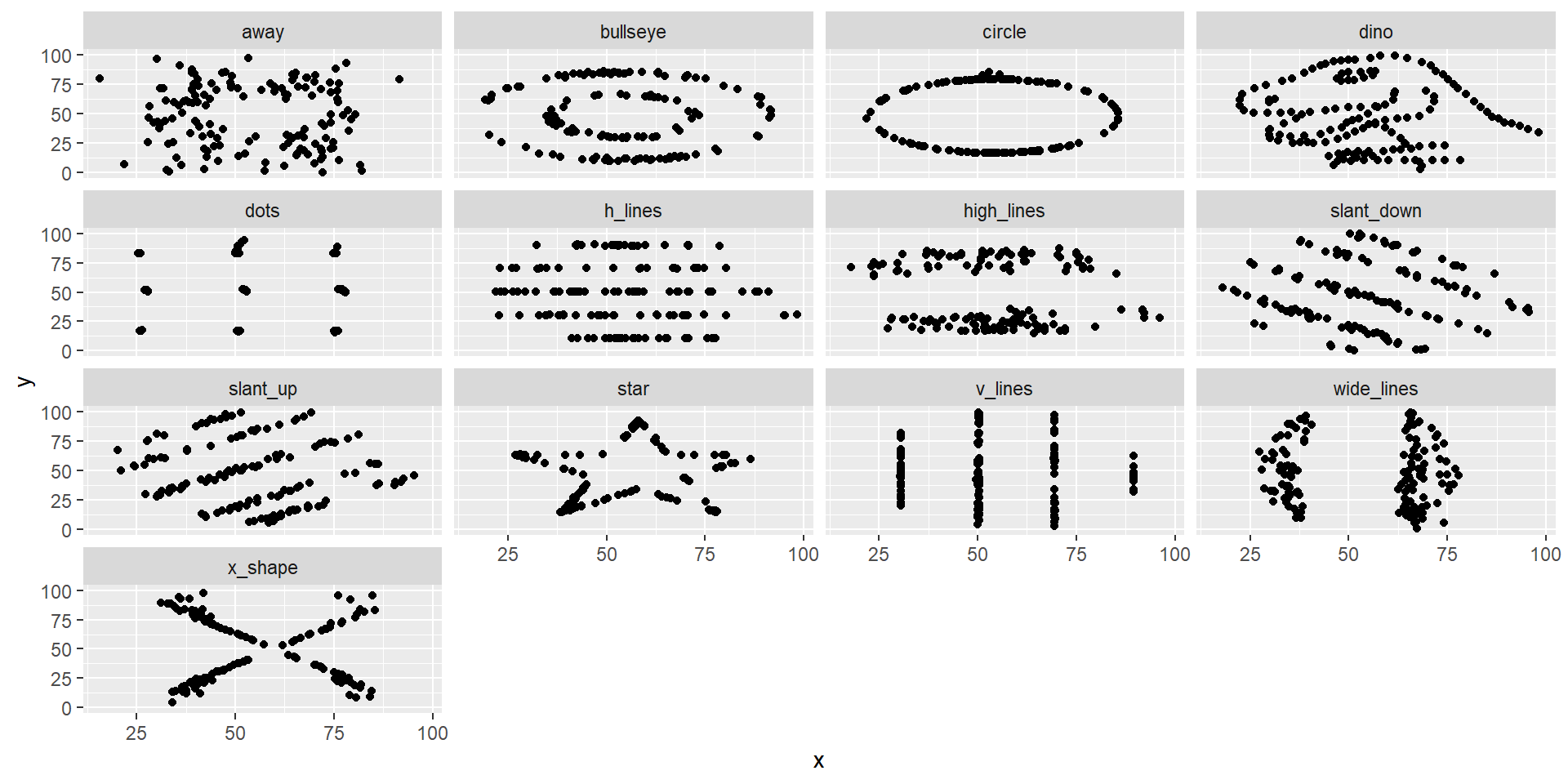
ggplot(datasaurus_dozen, aes(x = x, y = y)) +
  geom_point() +
  facet_wrap(~ dataset, ncol = 4)

Character height

Do you see anything out of the ordinary?
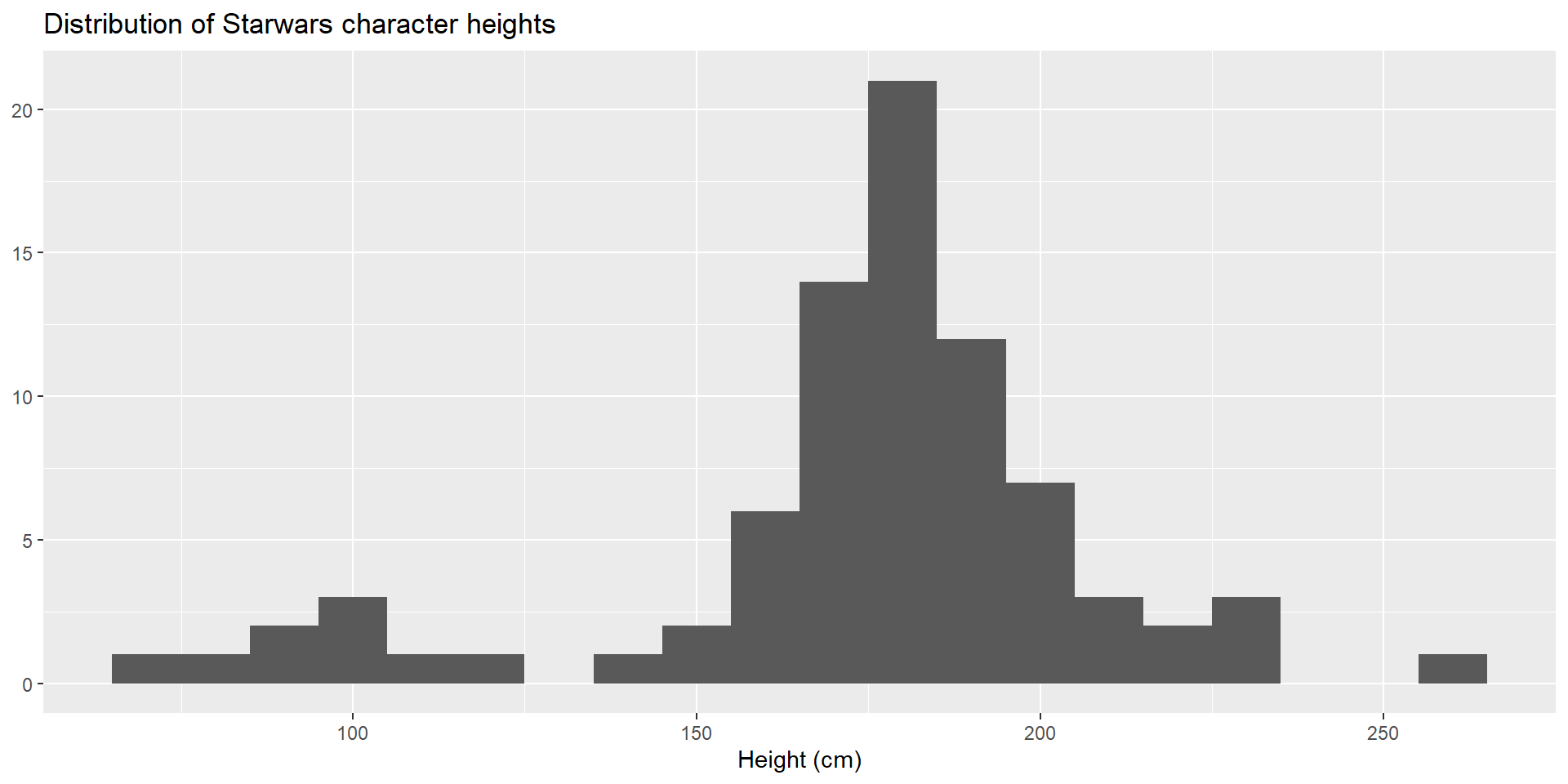
ggplot(starwars, aes(x = height)) +
  geom_histogram(binwidth = 10) +
  labs(
    title = "Distribution of Starwars character heights",
    x = "Height (cm)", y = NULL
    )

Character mass

How are outliers affecting what you can see in this distribution?

How are outliers affecting what you can see in this distribution?
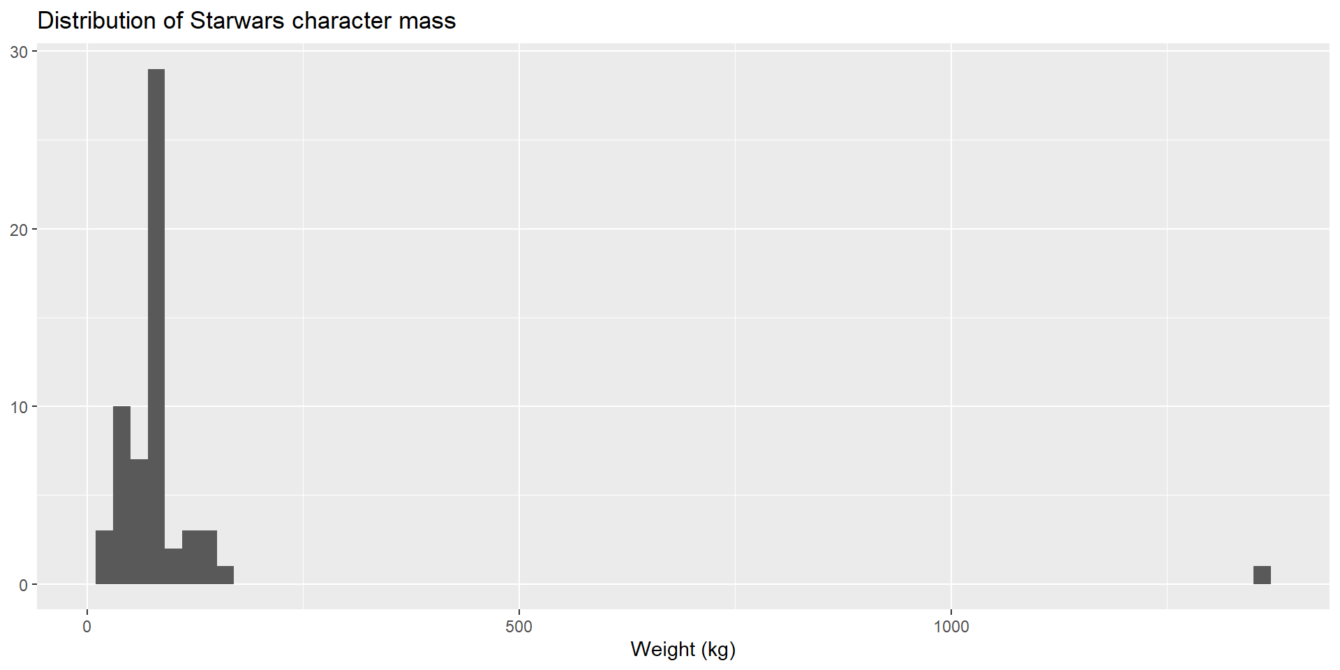
ggplot(starwars, aes(x = mass)) +
  geom_histogram(binwidth = 20) +
  labs(
    title = "Distribution of Starwars character mass",
    x = "Weight (kg)", y = NULL
    )

This page adapts material from Data Science in a Box (Unit 2, Deck 1: “Data and visualisation”) by Mine Çetinkaya-Rundel, licensed under CC BY-SA 4.0. Source: tidyverse/datascience-box. Modified: converted from reveal.js slides to a Quarto revealjs deck; Tmisc::quartet (Anscombe’s quartet) swapped for datasauRus::datasaurus_dozen, and dsbox::student_survey (age at first kiss, Facebook visits) swapped for starwars numerical variables, to avoid pulling in those two extra packages.